Media & Text block
Last updated:
Use the WordPress Media & Text block to place an image and text side by side. You can stack multiple Media & Text blocks and alternate the image placement to create a zig-zag effect. Unlike the Columns block, the Media & Text block always stacks images above the text on smaller screens, preserving reading order for all users.
Media & Text is also used inside of the UW Story Slider block.
Not sure if Media & Text is the right block? See Choosing a layout block.
Block toolbar
Visit the Media & Text block documentation on WordPress.org for more settings and detailed explanations.
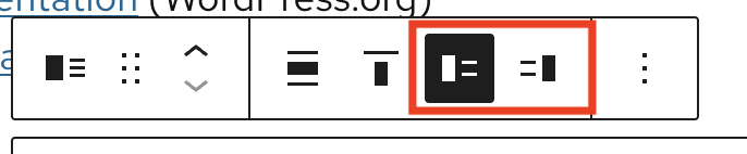
When you select the Media & Text block, a block toolbar appears above it with a few options. These settings include the ability to change content width, content alignment, and the position of media to the left or right.
Block settings
Visit the Media & Text block documentation on WordPress.org for more settings and detailed explanations.
Media options
- Media width: Adjust how much space the image takes up. It is recommended to keep this at the 50% default.
- Stack on mobile: Ensures content stacks properly on mobile. Avoid disabling unless you have a specific reason.
- Crop image to fill: Automatically crops the image so that it fits the entire column width. When enabled, you may use the focal point picker to adjust the image position.
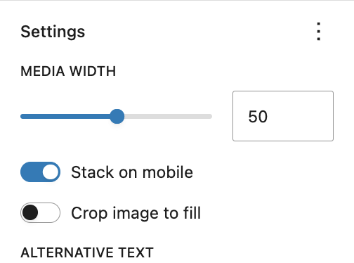
Image sizing guidelines
- Use images that are a minimum of 1620 pixels in height or width. Download and use 2400px images when using the UW Photo Library for best results.
- If your images appear pixelated or fuzzy, you may not have uploaded a large enough image.
- When stacking multiple Media & Text blocks to create alternating content rows, use images that are the same height and width otherwise sections will be even and inconsistent. Crop photos to a consistent size before uploading.
- Refer to patterns in UW Theme for examples of the Media & Text block in use.
Mobile stacking order
When the Media & Text block stacks on mobile, the image always appears above the text regardless of which side the image is on in the desktop layout. This preserves a natural reading order: image first, then the text that relates to it.
Some users try and create alternating image/text content sections with the Columns block if they need more precise control over image sizing. When using Columns, alternating image/text sections will not stack in the correct reading order.
Accessibility
Add alt text
Always add meaningful alt text to images. Alt text is read aloud by screen readers and describes the image to users who cannot see it. If the image is purely decorative and adds no meaning, leave the alt text field empty. Learn more writing alt text in UW’s Make it Accessible guide.
Add alt text to your image in the Media Library, rather than the block settings sidebar, so that it will display on every page it’s used.
Alternating content sections
A common pattern is stacking two or more Media & Text blocks with alternating image placement to create a zigzag layout. This can be visually effective, but you should avoid more than three alternating content sections. Longer zigzag layouts are harder to scan and can slow readers down, particularly users with cognitive disabilities or those reading on mobile.
For guidance on image-and-text layout readability, see image-text layouts and readability.
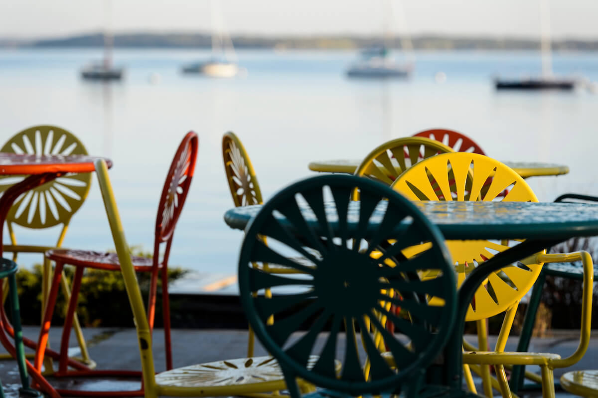
Examples
Alternating content
This example demonstrates stacking multiple Media & Text blocks and alternating image placement to form a simple zigzag layout.
Plan your visit
Find directions, parking info, and accessibility details before you arrive.

Talk with an advisor
Schedule a 20-minute appointment to review options and next steps.