Child Development Lab
Last updated:
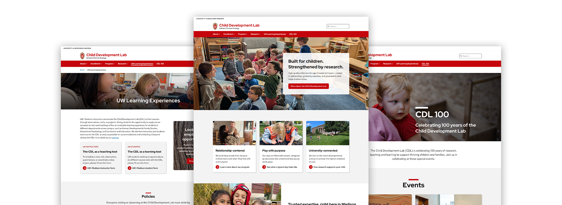
The Child Development Lab is an example of how using theme defaults and patterns thoughtfully with your own unique content results in a beautiful, accessible, and visually distinctive website. Here’s what stands out:

Accessible
Text over images have high contrast and use appropriate alt text.

Meaningful images
High-quality photos that support the content rather than decorate it.
Generous spacing
Content sections have enough padding to separate sections and reinforce visual hierarchy.

Easy to navigate
Short menu labels and brief submenus keep navigation scannable.

Plain language
Clear and well-written headings and links make the content easy to scan and digest.

Consistent design
A repeating mini-hero pattern ties every page together.
Notable page designs
Health Policies
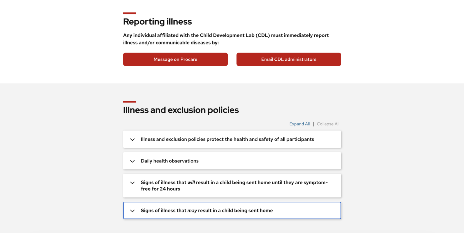
The page layout organizes a large amount of important information in a digestible way, with highest priority callouts at the top, and denser content bundled in accordions with clear headings.
People
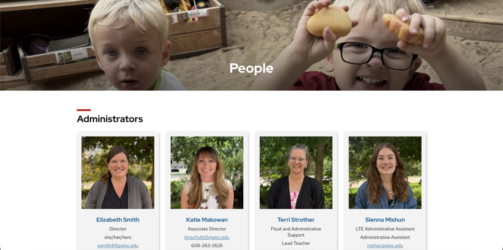
The CDL staff listing page is a nice use of the theme’s People Block with the card style enabled. Photos are shot and cropped with consistency, and alternating background colors distinguish the different sections.
Conduct Research
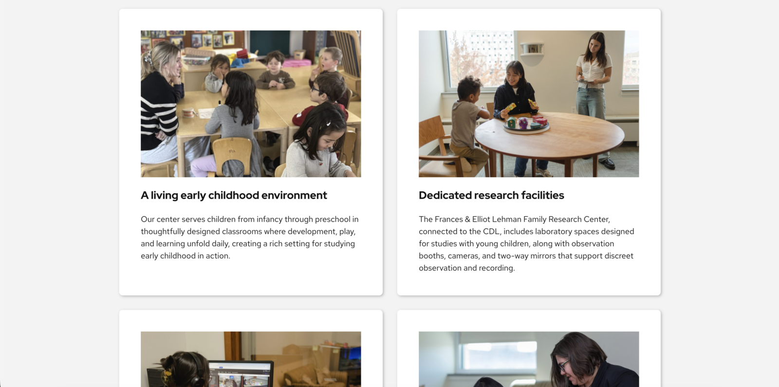
A logical heading structure and a plainly numbered five-step process turn a complex ask into an easy-to-follow path. Content is chunked into image-and-text sections instead of a wall of prose.
Need help making your content shine with the new theme?
Bring us your design questions!