Study Abroad Blog
Last updated:
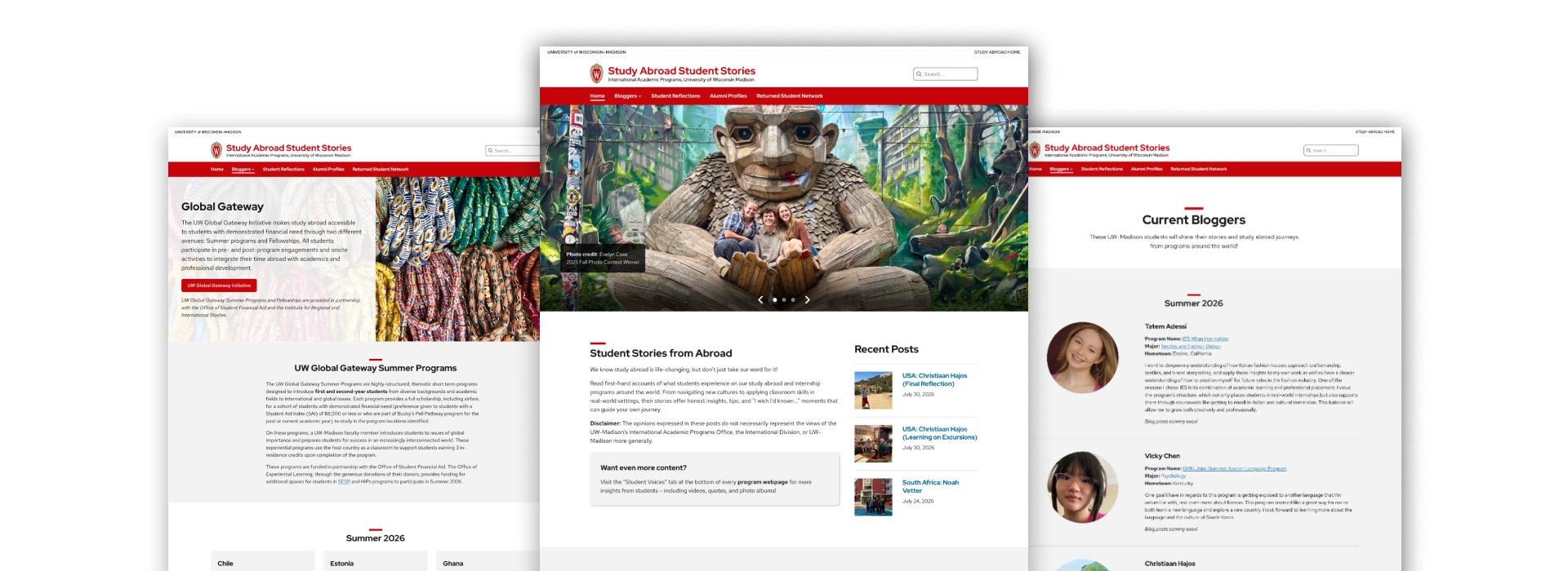
The Study Abroad Student Stories website highlights include: focused content strategy; excellent use of student photos; and spacious layouts that leverage theme patterns and defaults.
Visually balanced
Images support, not distract, from content, and focused content strategy keeps each section from becoming crowded with too much text.
Generous spacing
Spacing is applied consistently across pages, follows design guidance, and supports content flow.
Meaningful images
High-quality photos help tell stories of students’ experiences and reinforce the program’s mission.
Notable page designs
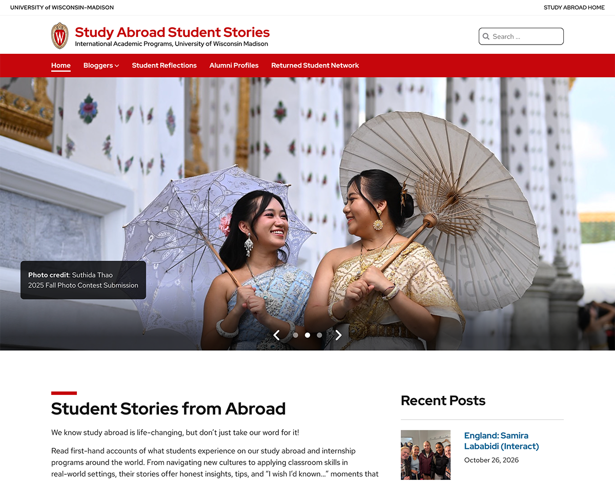
Homepage
The homepage prioritizes the most relevant content up top and makes good use of the hero carousel.
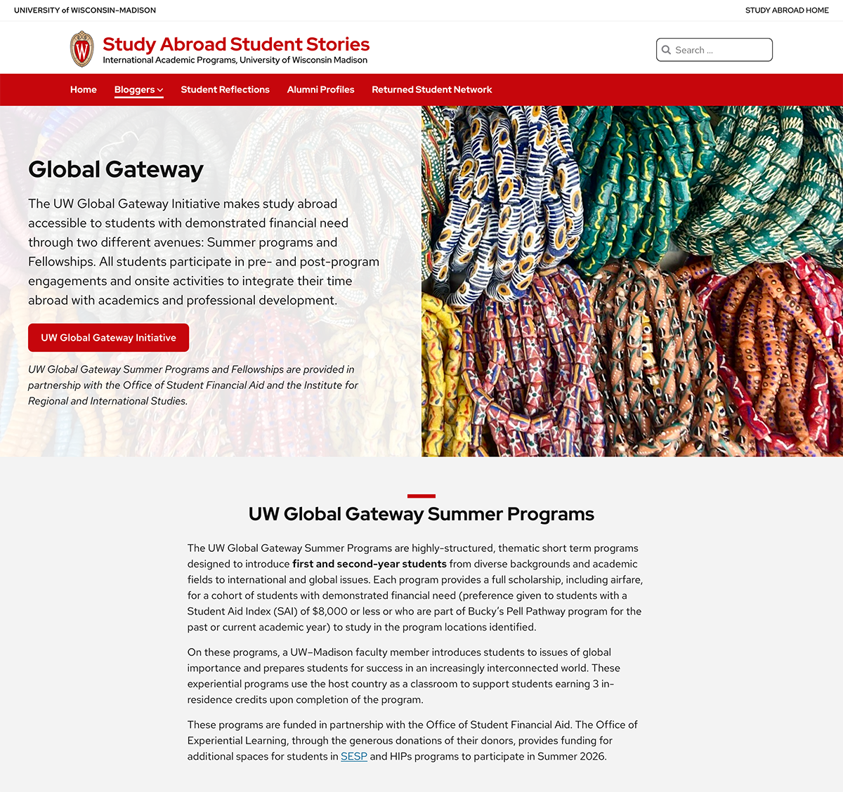
Global Gateway
The hero image is a perfect choice for a text overlay– the text doesn’t fall over any important visual content, like faces.
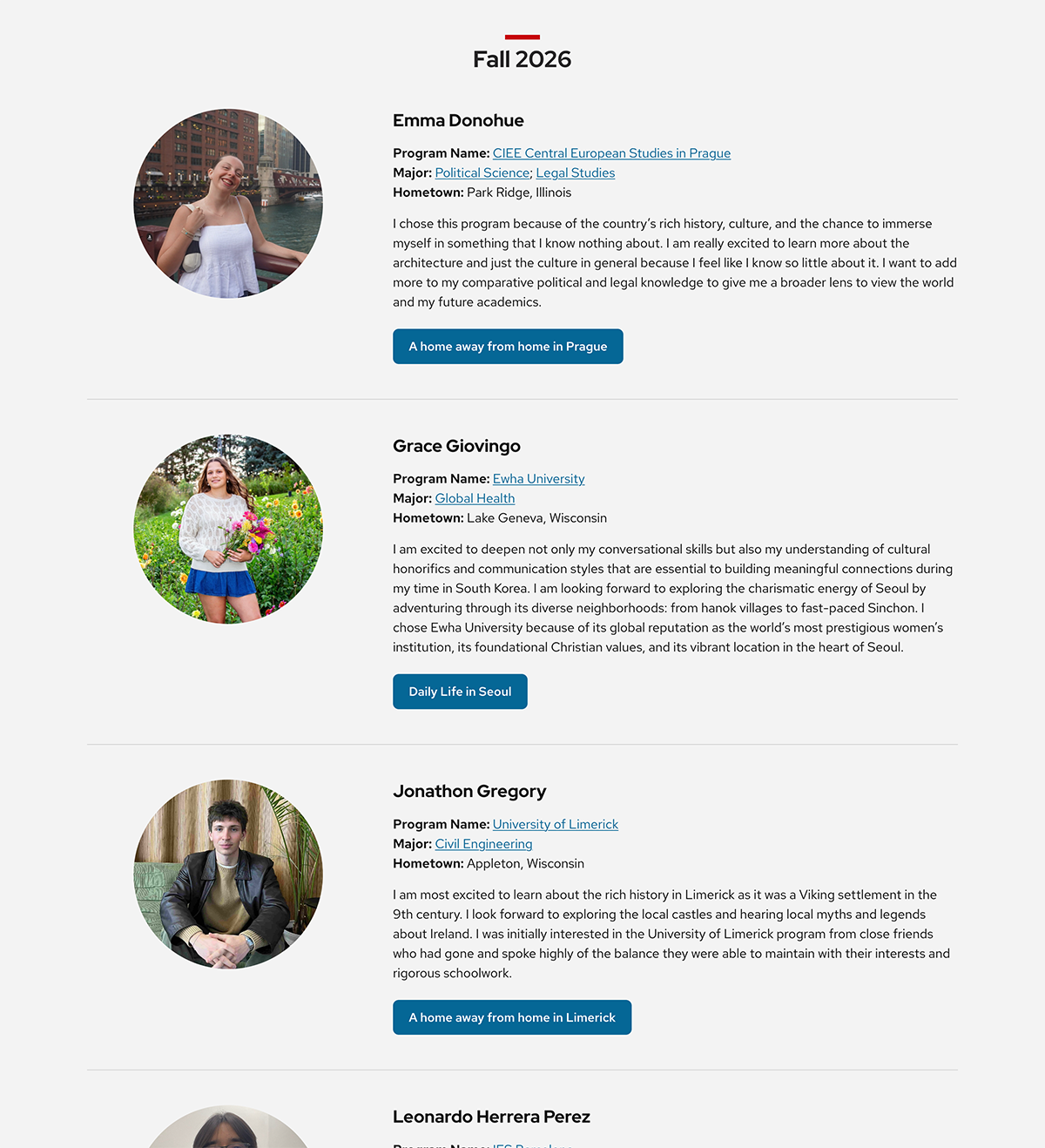
Current Bloggers
The blogger layouts are nicely spaced, separated by brand-consistent borders, and create visual interest with circle images.
Need help making your content shine with the new theme?
Bring us your design questions!