UW Group of Links
Last updated:
Display a list of related links in a clean, consistent style. You can also use this block for page jumps to sections on the same page or external links to other pages and helpful resources.
On this page
Block Preview
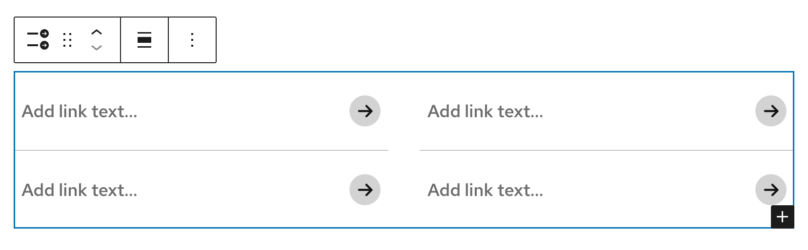
The UW Group of Links block has three different arrow styles similar to the UW Single Link block, making it easy to keep links consistent across your site. Links can display in one, two, or three columns, if the container is wide enough.
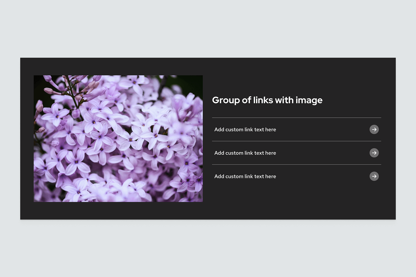
Circle arrow
Each link in the group includes a dark gray arrow icon inside a light gray circle, with hover animation. This is the most stylized option and works well when you want the entire set of links to stand out.
Arrow
Each link in the group includes a standalone arrow icon. This is a good choice for standard resource lists or for anchor links at the top of a page to help users quickly jump to sections on a long page. Both links and icons are blue, with hover animation.
No arrow
Links in the group have no icon, offering a cleaner, more minimal look. This option works well for anchor links, long lists, tight layouts, or when you want the group to take up less visual space. Links remain bold with hover animation, keeping them distinct without added icons.
One column
The UW Group of Links block will remain in a single column if its container is too narrow for multiple columns.
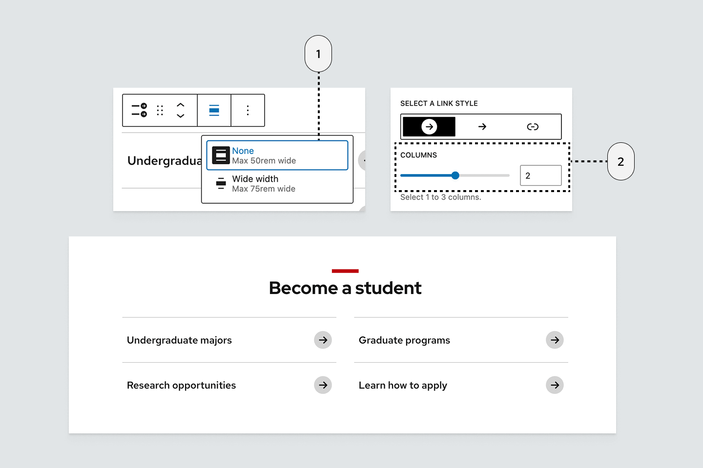
Two columns – narrow
By default, the UW Group of Links block is set to display at the narrowest width and two columns. This layout works well for most situations because it keeps the block aligned within the main content area and arranges links in a compact, scannable format.
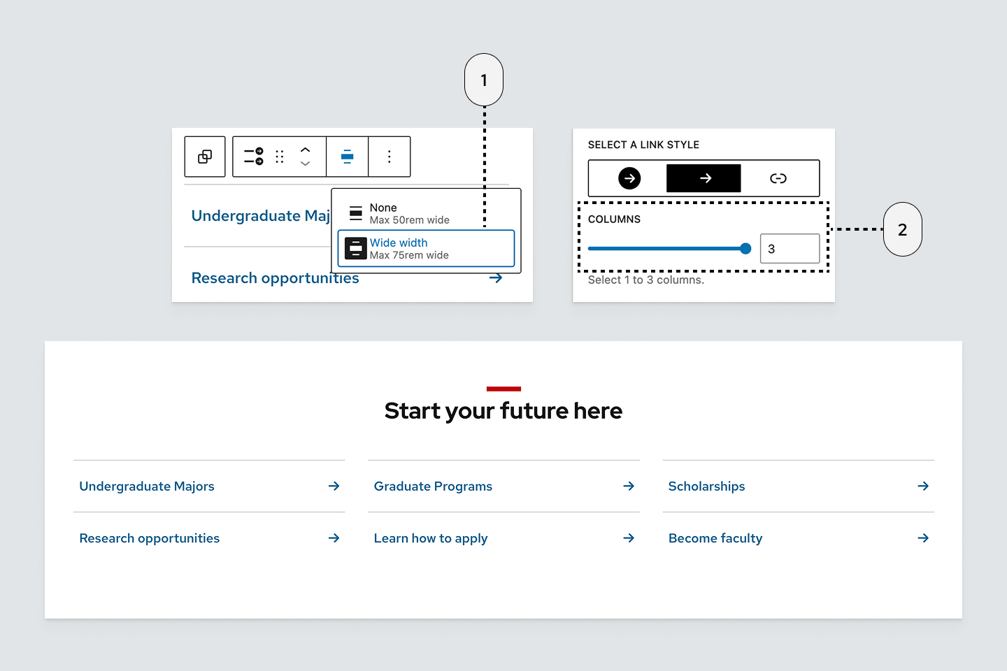
Three columns – wide
When set to Wide width, the UW Group of Links block can display up to three columns. This layout is useful for larger sets of links or when you want the block to span more of the content area for a more open, spacious look.
How to use
Insert the block
Using the Block Inserter, search for UW Group of Links and add it to your page. You can also type /uw group of links in a new paragraph block and press Enter.
Block settings
Open the righthand Settings sidebar to access additional style and layout options:
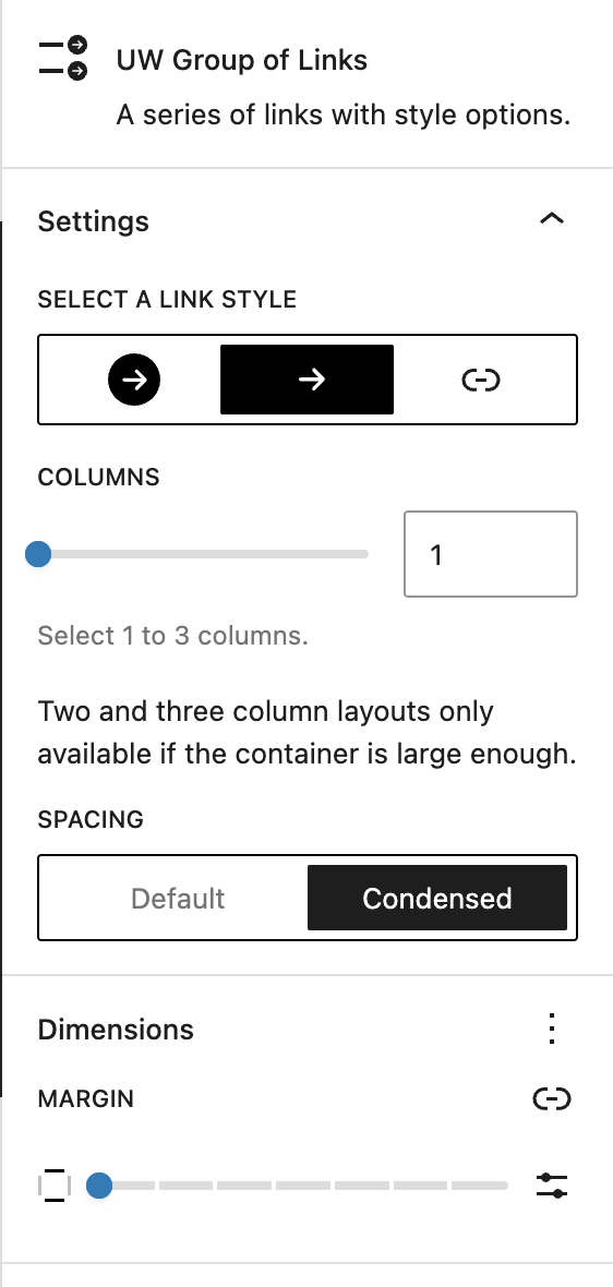
- Select a link style: Change the arrow icon and link styles.
- Columns: Select the number of columns for your links (up to 3).
- Spacing: Select between Default and Condensed spacing to increase or decrease the amount of space between each link item.
- Margin: Add space above and below your links.
Set and edit a link
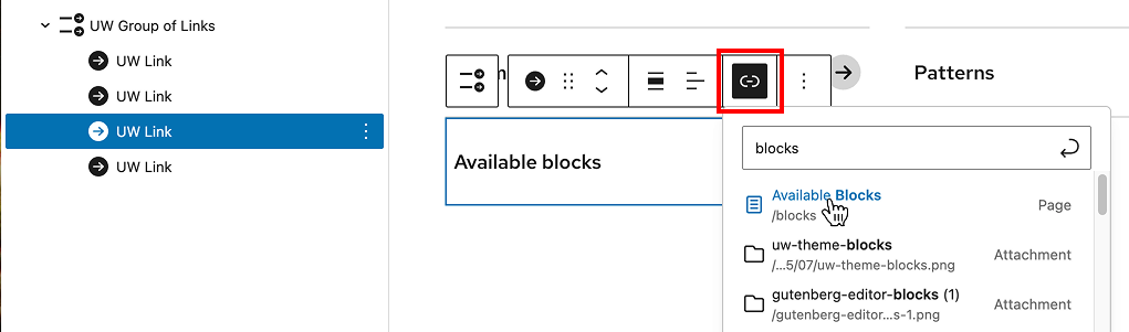
- Select an individual link in the List View or by clicking it directly in the editor.
- In the block toolbar, select the Link icon.
- Search for and select a page, or paste/type a URL to add the link.
Remove an individual link
You can delete a block from the three-dot menu in either List View or the Block Toolbar.
Recommendations
Look for patterns in the theme that use groups of links under the Link category as a starting point.

When to use
- To group related links together in a scannable, uniform style.
- To create a table of contents or page jumps for navigating a long page.
- To highlight related resources, documents, or tools in one place.

When to consider something else
- You have fewer than three links. Use the Buttons or the UW Link blocks instead.
- You have more than 6-8 links in a narrow layout and want a more compact list than the Group of Links block provides. Use the WordPress List block instead.
- You’re linking to a collection of pages or posts. Use the Query Loop block instead.
- You need more descriptive content with each link.
Usability and accessibility
- When sharing multiple links, always use UW Group of Links instead of stacking individual UW Single Link blocks.
- UW Group of Links creates a proper list in the page structure (
<ul><li>), so screen readers can recognize it as a list and announce how many items it contains. - Use clear, descriptive link text that tells users what to expect, and avoid vague phrases like “Click here” or “Learn more.”
- Keep the number of links manageable so users can scan them quickly.
- More than eight links can feel cluttered and overwhelming. Break them up into smaller groups with clear headings.
- For page jumps, ensure that each destination section has a clear heading for both users and screen readers.