Image sizing guidelines
Last updated:
This guide shows you how to size images for UW Theme 2.0 and WordPress, so they look sharp on any device without slowing your pages down.
UW Theme 2.0 does not have required image sizes for blocks or patterns. The best image size depends on where the image appears, how large it displays, and what aspect ratio it uses.
Key definitions
These terms will help you make better choices when uploading and displaying images in WordPress.
- Dimensions: the width and height of an image, expressed in pixels, such as 2400px by 1598px.
- Resolution: the overall detail and sharpness of an image. In general, images with more pixels appear sharper.
- Aspect ratio: the shape of an image, such as square (1:1) or wide (16:9). It’s written as two numbers separated by a colon: width first, height second.
- File size: the amount of storage space an image file uses, usually measured in kilobytes (KB) or megabytes (MB).
- Compression: the process of reducing an image’s file size while keeping its visual quality.
- Responsive: content that adjusts to different screen sizes, such as desktop, tablet, and mobile.

Low resolution
A 200 × 133px image of Bucky looks blurry when stretched to fill this area. It doesn’t have enough pixels to stay sharp.

High resolution
A 2400 × 1598px uploaded image of Bucky stays sharp at this size because it has enough pixels to fill the space cleanly.
Where to find images
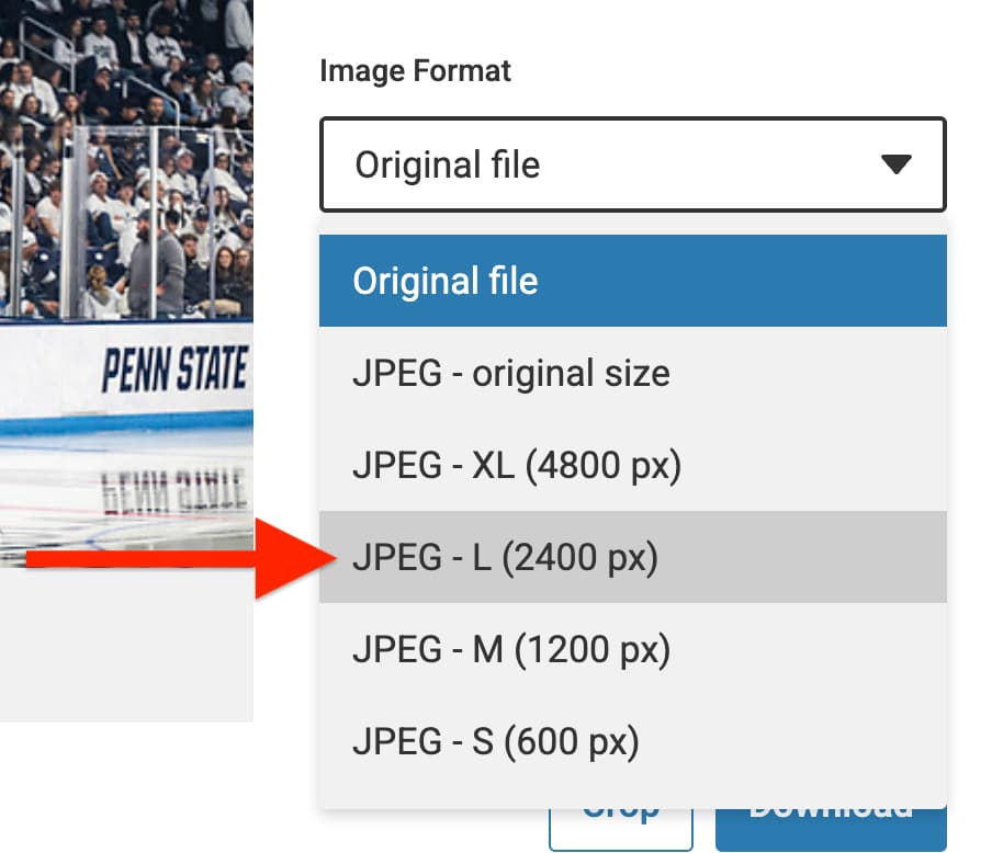
The UW Photo Library is a good starting point for high-quality campus imagery. Download JPEG – L (2400px) for most uses. That’s the best default size to start with.
If you’re using an image from another source and are not resizing before upload, make sure it’s at least 1620px in its largest dimension (height or width). If you upload an image smaller than that WordPress may not generate all the image sizes you may need.
Crop images
If the subject needs better framing, crop the image in a tool like Adobe Photoshop, Preview (Mac), or Windows Photos. For blocks without an aspect ratio setting (like Media & Text, UW People Plugin, and UW Story Slider, it’s the only way to control the how the image looks inside these blocks.
It’s especially helpful when:
- important details near the edge might get cut off by a responsive layout,
- the subject is too far from the center, or
- you need a specific shape (square, wide, or tall) to match your layout.
- you want faces to appear the same size and position within a frame for a UW People Plugin.
Learn more about using Adobe Creative Cloud at UW–Madison for access to Photoshop.
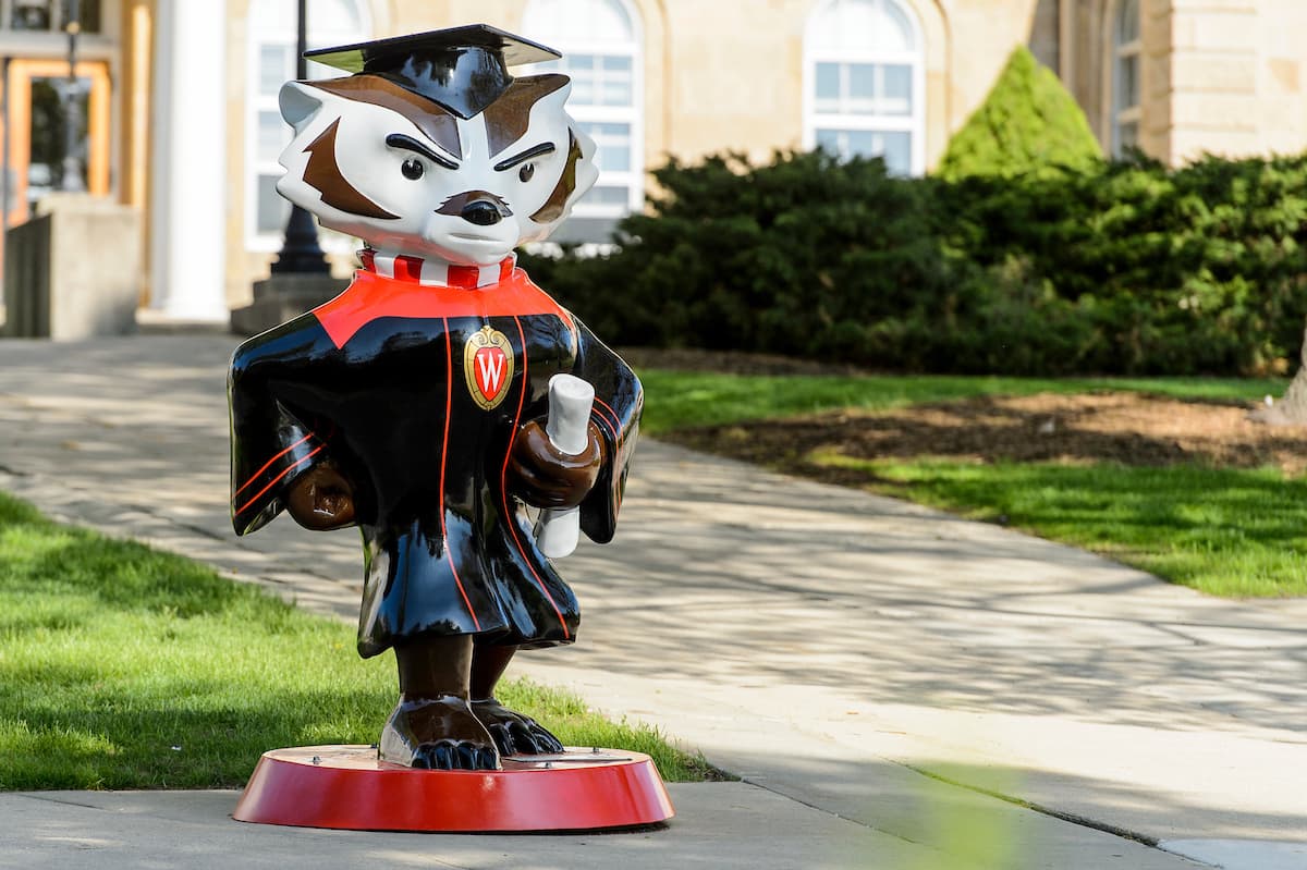
Before cropping
The Bucky statute in the original image is off center with empty pavement on the right.
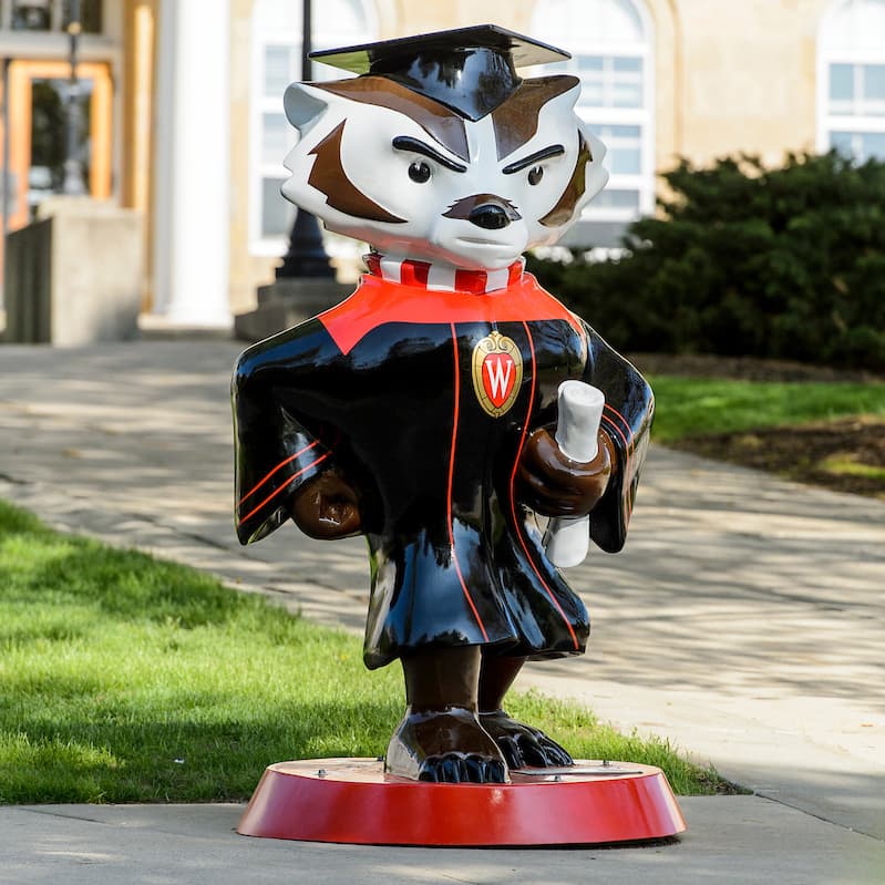
After cropping
The image is cropped to be a perfect square so the Bucky statute is always centered in the frame.
Pick the right file type
Use the file type that matches the kind of image you are uploading:
| File type | Best for… |
|---|---|
.jpeg/.jpg | Regular photos, like images of people, places, and events. |
.webp | Like .jpeg, but generates even smaller file sizes with high quality. |
.png | Logos, icons, graphics with transparency. Do not use .png files unless you have a specific reason. PNG files are usually much larger and can slow down your page. |
Note about .webp files
Use .webp only if you want to go the extra mile for performance. For images reused in emails, use JPG or PNG unless you have confirmed WebP support for your email audience. It’s a newer image format developed by Google, but can be unstable for email clients.
Reduce the file size of images
Aim for 500 KB or smaller. The goal is to make an image file size as small as possible while keeping the image quality visibly the same. The free browser app Squoosh can compress images and convert JPGs to WebP.

Before compression
Larger file size (2.2 MB), slower to load.
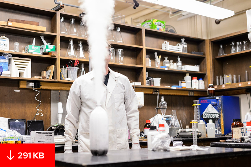
After compression
Smaller file size (291 KB), looks the same.
Using the right size in WordPress
When placing an image in a block on your page, you have options for both the Resolution of the image and the Aspect ratio in the block’s settings sidebar on the right side of the editor.
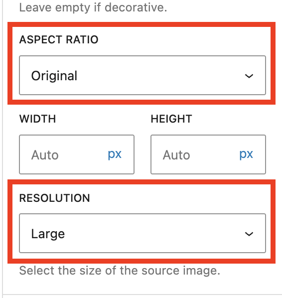
Resolution
When you upload an image that’s at least 1620 pixels in its largest dimension (height or width), WordPress automatically creates three smaller copies:
- Thumbnail (300px)
- Medium (600px)
- Large (1600px)
These image sizes are used for the theme in the WiscWeb WordPress Service, and are larger than what is set in a typical WordPress installation. If you self-host UW Theme 2.0, we recommend using these sizes to ensure images look great in the theme. Visit the WordPress Settings Media screen guide to learn how to update these values.
WordPress compresses these generated versions, but the original file you uploaded stays as-is. That is why it is still important to compress images before uploading them.
Why WordPress creates different image sizes
WordPress uses these versions to automatically serve a more appropriate image size to different devices. This happens behind the scenes and helps your pages load faster without requiring you to manually create every version yourself.
You can pick a smaller resolution to help your page load faster, but picking one that’s too small for the space is a common mistake. For example, a Thumbnail resolution would look blurry in a Cover block that spans the full width of the page. A Large size would look crisp in that scenario.
If your block has a Resolution setting (Image and Cover do), use the table below to pick the size that matches the space the image fills.
| Size | Use when… |
|---|---|
| Thumbnail (300 px) | Rarely used in UW Theme, but can be used for small accents or icons. |
| Medium (600 px) | Narrow layouts like multi-column cards, and images that display at 600px wide or less. |
| Large (1600 px) | Full browser-width images (like a hero), most body images on standard pages. |
| Full size (original) | Only if your image is less than 1600 px, or if you’ve compressed the original image yourself so it’s file size is smaller. |
Aspect ratio
The Image and Cover blocks let you adjust aspect ratio in the block settings sidebar. Others, such as UW People Plugin, UW Story Slider, and Media & Text, don’t. For those blocks, you must crop images to your desired aspect ratio before uploading.
The aspect ratio setting is helpful when:
- the original image is large enough, but just not the right shape yet.
- you want the image to better fit the layout.
- you need a square, wide, or tall display shape.
Below shows examples of a few common aspect ratio sizes you might select in WordPress, like Classic (3:2), Square (1:1), and Wide (16:9). Images downloaded from the UW Photo Library already use the Classic (3:2) aspect ratio.
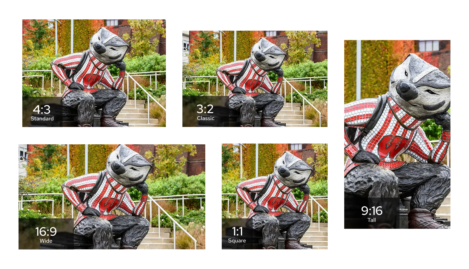
Keep ratios consistent across similar blocks. When several images sit side by side or stack on top of one another (like cards, alternating image/text rows, or other repeated layouts), matching aspect ratios makes the images appear the same height and the layout feels more polished.
Dimensions cheat sheet
These dimensions are for designers who are pre-sizing or cropping images to match specific patterns in the UW Theme. Use them as a guide, not exact requirements.
The sizes below follow a rule of thumb: size your image at roughly 2 times the space it will display in, measured in both height and width. That keeps it sharp on high resolution phones, tablets, and laptops. For example, if an image will display in a 600 x 400 layout, upload one that is 1200 x 800. If you need dimensions for a pattern that isn’t listed here, you can apply the same rule.
- 1440 × 960 (most used)
- Media & Text block
- UW Hero Carousel block
- UW Story Slider
- Images in card patterns
- Alternating content patterns with the Media & Text block
- Hero/banner patterns with the Cover block
- 1000 × 1000
- Faculty/staff images in the UW People Plugin
- Images of people in testimonial/quote patterns
- 1440 × 810 (least used)
- Used in the Alternating content with images at full-width pattern
- The shorter height at a large width creates a more cinematic look
Reduce the file size before uploading
All of the sizes listed above are under 1620 px, which means WordPress won’t generate a Large resolution version. These images will default to displaying at the Full Size resolution (your original file size), so compress each image to 500 KB or smaller before uploading.
Before you publish
Use this to check your work before a page goes live.
- Is the image high-resolution enough to stay sharp? Where to find images
- Is the right Resolution set in WordPress to match the space? Choose the right resolution
- Is the image saved as .jpeg or .webp? Pick the right file type
- Is the file 500 KB or smaller? Reduce the file size of images
Common questions
Sizing images can be complicated. If you need further guidance, please join Office Hours.
If an image looks blurry on the page, first check whether you selected a resolution size that is too small. Try choosing a larger resolution size in WordPress.
If the image still looks blurry, you may need to upload a larger version of the image if one is available. If everything looks clear, you are in good shape.
No. Large is the recommended default for most layouts. Pick a different resolution when the image fills a smaller space on the page: Medium typically works well for images inside narrow columns. Use Thumbnail for small accents or icons.
Full size is the one to be careful with. Only pick it if you’ve pre-sized and compressed the image yourself. See How WordPress sizes images for details on each option.
Some blocks, including Media & Text, the UW People Plugin, and the UW Story Slider, don’t offer an aspect ratio setting in the sidebar. For those, crop your image to the right shape before uploading. Visit the Crop images section for more information.
These blocks are designed to fill a container whose size changes with the screen — wide and short on desktop, tall and narrow on a phone. Your image gets cropped differently in each case so it always fills the space.
You can control which part of the image stays visible using the focal point picker in the block’s sidebar. Drag the dot to the most important area of the image, and that area will stay visible at every screen size.
If you’re trying to avoid the crop so that text embedded in the image will always show, don’t do this. Text baked into an image gets clipped unpredictably at different screen sizes, and it’s not accessible to screen readers or search engines.
Individual profile pages using the UW People Plugin expect images to be at least 800 pixels in height or width. If the image is smaller than 800 px, the plugin displays it at its original shape instead.
Replace the image with one at least 800 × 800 (or better, the 1000 × 1000 listed in the Dimensions cheat sheet) and re-insert it.
If the photo you’re uploading is less than 800px in width in the UW People Plugin, the image may appear pixilated on the person’s page or in a list of people. Reach out to the person who provided the photo to request a larger image or the original image file.
If you are able to crop the images in a square in a way that peoples’ head sizes are roughly the same and their eyes line up roughly in the same place within that square, they will look more uniform in the UW People Listing block.