Buttons
Last updated:
Adds a button that draws attention to an important action with a clear, clickable surface. Common examples include Apply, Register, Donate, Submit, or Download.
On this page
Block Preview
Badger Red
Blue
Black
White
Cover block
If a white outline button is placed inside the Cover block with a background image, the block automatically adds a dark overlay behind it to improve contrast.
Badger Red and Blue
On the theme’s dark gray background, the primary and secondary color buttons automatically add an outline to improve contrast.
How to use
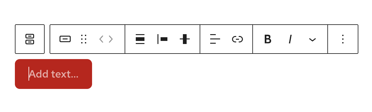
Insert the block
Using the Block Inserter (+ icon), search for Buttons and select it. You can also type/buttons in a new paragraph block and press Enter to add it quickly.
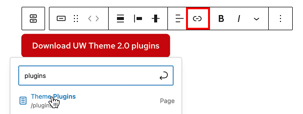
Set and edit a link
- Select an individual button in the List View or by clicking it directly in the editor.
- In the block toolbar, select the Link icon.
- Search for and select a page, or paste/type a URL to add the link.
Adjust button styles
In the block settings sidebar, you’ll find options to adjust the look of your button. Choose between Fill (solid button) or Outline (border only).
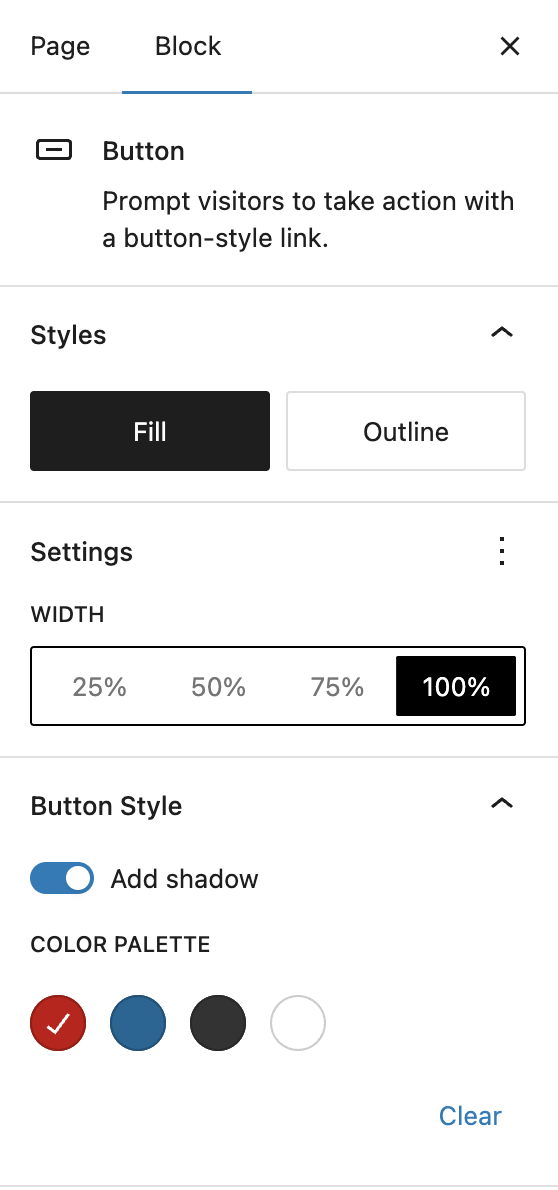
Width
Set button width to 25%, 50%, 75%, or 100% of the available space. If no width is set, the button fits the text, which works best in most cases. Use 100% only when you need equal-width buttons. Otherwise, leave the width unset unless you have a specific design need.
Shadow
Add a subtle dropshadow to make the button stand out, especially on images.
No shadow
Shadow
Color
Pick from the color palette (Red, Blue, Black, or White) to change the button color.
Layout
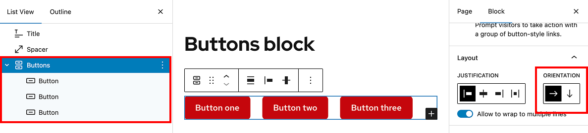
Button groups
The Buttons block acts as a group. Each time you add or duplicate a button inside it, the buttons display together in a vertical row. You can switch the orientation of the buttons in the block settings if you want to line them up horizontally.
Two horizontal buttons
Two vertical buttons
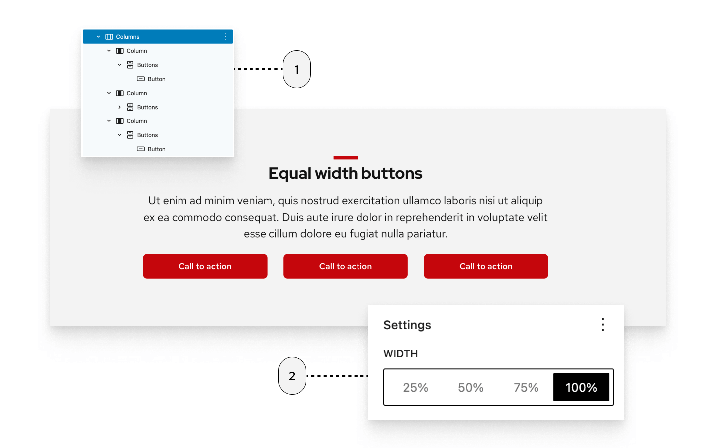
Equal width group of buttons
A common design is a row of equal-width buttons. To create this, place buttons inside a Columns block and set each one to 100% width. An easier option is to use a pre-built pattern in the theme.
The image below shows:
- Three button blocks placed in three columns using the Columns block
- Each button set to 100% width to make them equal size in each column
Recommendations

When to use
Use buttons for the most important actions you want users to take on your site. Common examples include Apply, Download, Submit, or Register.
When to consider something else
- If the action simply takes users to another page or resource, use a regular text link or the UW Link block instead of a button.
- If the action is secondary or less important, style it as a link instead of a button.
Usability and accessibility
- Follow the Links and buttons guidance from the Center for User Experience.
- Do not use ALL CAPS for button labels. Use sentence-case capitalization instead.
- Avoid using too many buttons on a page. If everything is a button, nothing stands out.
- Keep button text short and lead with a verb to make the action clear (e.g., “Download transcripts” instead of “Click here to download”).
- Don’t place buttons within a sentence or paragraph. Always put them on their own line so they stand out as actions.

Design
Stay consistent
Use button styles consistently across your site.
Badger Red is UW–Madison’s primary brand color and should be the default choice.
Use blue buttons sparingly for a calmer tone or when red feels too strong for your design.
Use black buttons occasionally, but not as your main style. Best for storytelling.
Outlined buttons
Outlined buttons are designed to sit next to a filled button, helping show which action is primary and which is secondary.
Drop shadow
Use dropshadows sparingly. They work best on images and dark backgrounds for extra contrast, but can feel heavy or distracting if applied to every button.