Cover block
Last updated:
Use the WordPres Cover block to place content on top of a background image or gradient, like a hero image. It is the only block in UW Theme that supports background images, gradient colors, and overlay opacity. This gives you more design flexibility, but also more ways to create inaccessible contrast and readability problems.
Not sure if Cover is the right block? See Choosing a layout block.
Video overview
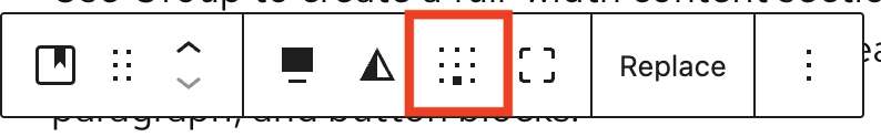
Block toolbar
Visit Cover block documentation on WordPress.org for more settings and detailed explanations.
When you select the Cover block, a block toolbar appears above it with a few options. The most commonly used features:
- Change alignment: set width to none, wide width, or full width
- Duotone: Automatically color your image black/white
- Content position reposition text over the image to improve contrast and readability
Block settings
Visit Cover block documentation on WordPress.org for more settings and detailed explanations.
In the block settings sidebar, below are the most commonly used options for Cover in UW Theme.
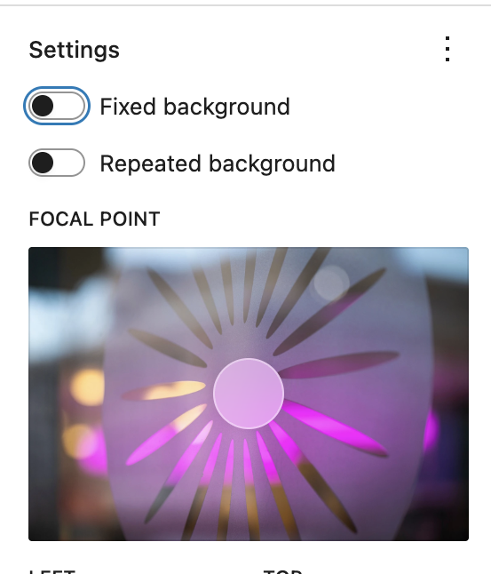
Image options
- Fixed background: Image stays in place as the user scrolls creating a subtle parallax effect.
- Repeated background: Repeat the same image to form a graphical pattern. See example on WordPress.org.
- Focal point: Only appears when Fixed background is enabled. Drag the focal point to highlight the most important areas of an image.
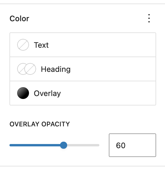
Color options
The Cover block includes Text, Heading, and Overlay color options.
Select an overlay color or gradient and adjust the Overlay Opacity slider until text is clearly readable.
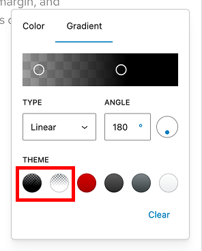
Gradients
Use the UW Theme’s gradient presets when applying an overlay over images for better readability. These have been created with accessibility in mind.
Gradients for text over images
The theme includes two gradients designed specifically to improve text readability when text is placed on an images:
- Image with Text – Black Gradient
- Image with Text – White Gradient
Adjust the opacity and gradient start/stop points as needed to create enough contrast for your text.
Gradients for solid background colors
The following gradients are designed to be used as solid background colors without images. They are designed to create visually distinct sections while keeping text clear and readable.
Avoid using Badger Red on top of images, it reduce contrast and make text harder to read.
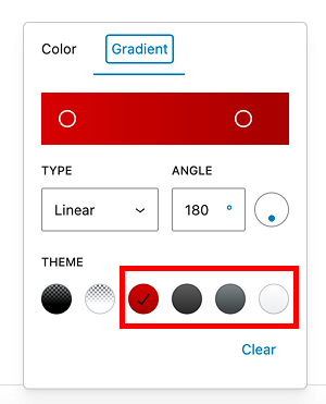
Badger Red Gradient
Dark Gray Gradient
Medium Gray Gradient
Light Gray Gradient
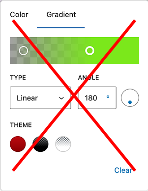
Don’t use custom gradient colors
While the editor allows custom hex values for gradients, these should be used with caution. This option is provided only to improve contrast and readability.
Custom or non-brand colors can reduce contrast and make text harder to read. In most cases, use the preset gradients and adjust opacity or gradient position instead.
Images sizing and resolution
- Use images that are at least 1440 wide and 960 high in pixels for full-width heros.
- You can increase the height of the Cover block by dragging the bottom of the block down directly in the editor.
- Background images in the Cover block crop and scale to fill the full width of the block at different screen sizes. Images that contain embedded text or logos may get cut off. If you need an image to be a precise height and width, use the Image block instead.
- If your background images in the Cover block appear pixelated or fuzzy, check to make sure you have “Full size” selected under Resolution in the block settings.
- Refer to patterns in the UW Theme in the Banner category for examples of hero images using the Cover block.
Accessibility
Add alt text
Always add meaningful alt text to images. Alt text is read aloud by screen readers and describes the image to users who cannot see it. If the image is purely decorative and adds no meaning, leave the alt text field empty. Learn more writing alt text in UW’s Make it Accessible guide.
Add alt text to your image in the Media Library, rather than the block settings sidebar, so that it will display on every page it’s used.
Text contrast
Text placed on top of images must have sufficient contrast to be readable by all users, including those with low vision. Always apply an overlay color or gradient when placing text over a photo.
Never rely on the image alone to provide enough contrast. A black overlay set to 60-80% overlay opacity is recommended for most photos.
Very weak text contrast
Don’t do this
No overlay applied and text is barely legible.
Better text contrast
Do this
Image with Text – Gradient applied with 70% opacity.
Don’t place text over busy image areas
Even with an overlay, text placed over complex or high-detail areas of an image can be hard to read. Reposition the Focal point of the image in the Cover block to place text over a simpler area of the image. This can significantly improve readability, especially on wide images.
Harder to read
Don’t do this
Add text over a busy part of an image.
Easier to read
Do this
Reposition the photo to text displays over a less busy part of the image.
Don’t embed text in images
Text baked into a background image, such as a headline, tagline, or logo with words, is not accessible. Screen readers cannot read it, browsers cannot resize or translate it, and it may get cropped unpredictably across screen sizes.
If the content matters, use text blocks instead to add the content. They’re designed for real text that is readable, scalable, and accessible to all users.
If you need a logo or wordmark in a Cover block, place it as an Image block inside the Cover rather than baking it into the background. Add meaningful alt text so screen readers can describe it.
Test on mobile
When you reposition content or change the background image, always check how the layout appears on smaller screens. Images are cropped differently on mobile and text can end up over a busier or lower-contrast area of the image than on desktop. Use the editor’s View feature to test on Mobile, Tablet, and Desktop before publishing.
Examples
Text on image with parallax effect
In this example, the Fixed background setting is enabled, which creates a parallax effect. The Image with Text – Black Gradient is applied at 70% opacity.
Spring tulips at UW
Gradient background color
Below is a pattern in the theme in the Pre-footer category that uses the Badger Red gradient as a background color.
Call to action pre-footer
Praesent dapibus neque id cursus faucibus tortor neque egestas auguae eu vulputate magna eros eu erat. Aliquam erat volutpat.
Advanced: Nested Cover blocks
This example uses nested Cover blocks to create a white screen behind text on top of a photo. The outer Cover sets the background image. The inner Cover adds a semi-transparent overlay behind the text to ensure text is readable.
Layering the Covers helps keep text readable across different images, but it’s an advanced layout. Refer to patterns in the UW Theme for examples and best practices.
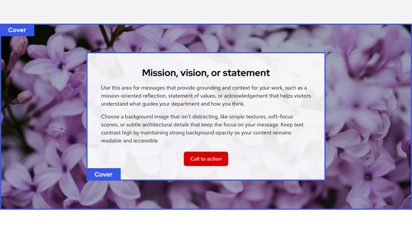
Mission, vision, or statement
Use this area for messages that provide grounding and context for your work, such as a mission-oriented reflection, statement of values, or acknowledgement that helps visitors understand what guides your department and how you think.
Choose a background image that isn’t distracting, like simple textures, soft-focus scenes, or subtle architectural details that keep the focus on your message. Keep text contrast high by maintaining strong background opacity so your content remains readable and accessible.