UW Accordion
Last updated:
Organize content into sections that can expand or collapse. Best for FAQs, instructions, or content that doesn’t always need to be visible.
On this page
Block preview
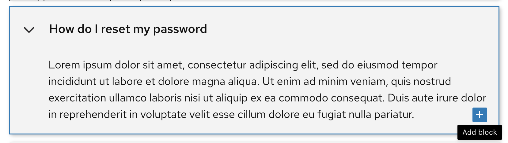
Lorem ipsum dolor sit amet, consectetur adipiscing elit, sed do eiusmod tempor incididunt ut labore et dolore magna aliqua. Ut enim ad minim veniam, quis nostrud exercitation ullamco laboris nisi ut aliquip ex ea commodo consequat. Duis aute irure dolor in reprehenderit in voluptate velit esse cillum dolore eu fugiat nulla pariatur.
Lorem ipsum dolor sit amet, consectetur adipiscing elit, sed do eiusmod tempor incididunt ut labore et dolore magna aliqua. Ut enim ad minim veniam, quis nostrud exercitation ullamco laboris nisi ut aliquip ex ea commodo consequat. Duis aute irure dolor in reprehenderit in voluptate velit esse cillum dolore eu fugiat nulla pariatur.
Lorem ipsum dolor sit amet, consectetur adipiscing elit, sed do eiusmod tempor incididunt ut labore et dolore magna aliqua. Ut enim ad minim veniam, quis nostrud exercitation ullamco laboris nisi ut aliquip ex ea commodo consequat. Duis aute irure dolor in reprehenderit in voluptate velit esse cillum dolore eu fugiat nulla pariatur.
Lorem ipsum dolor sit amet, consectetur adipiscing elit, sed do eiusmod tempor incididunt ut labore et dolore magna aliqua. Ut enim ad minim veniam, quis nostrud exercitation ullamco laboris nisi ut aliquip ex ea commodo consequat. Duis aute irure dolor in reprehenderit in voluptate velit esse cillum dolore eu fugiat nulla pariatur.
Lorem ipsum dolor sit amet, consectetur adipiscing elit, sed do eiusmod tempor incididunt ut labore et dolore magna aliqua. Here’s some custom text. Ut enim ad minim veniam, quis nostrud exercitation ullamco laboris nisi ut aliquip ex ea commodo consequat. Duis aute irure dolor in reprehenderit in voluptate velit esse cillum dolore eu fugiat nulla pariatur.
How to use
Insert the block
Using the Block Inserter (+ icon), search for UW Accordion and select it. You can also type /uw accordion in a new paragraph block and press Enter to add it quickly.
Add inner content
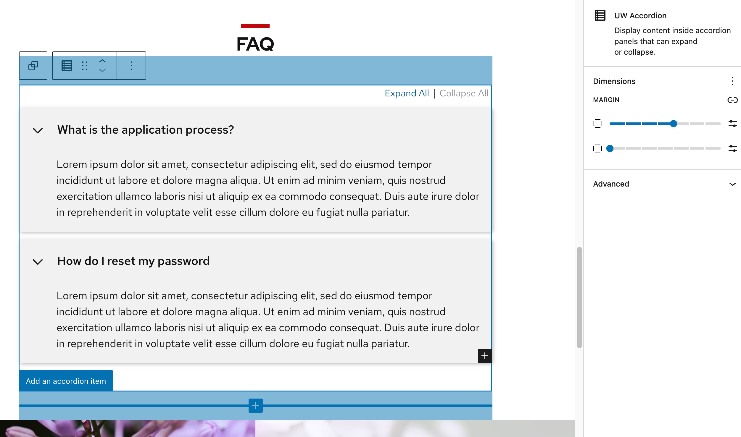
Select an individual accordion item and click on Add block (small button with plus icon) in the lower right to choose a block inside an individual item (e.g., images, lists, headings).
Block Settings
Adjust the top and bottom margin in the block settings panel to add more space above and below your accordion group. This panel opens in the right sidebar when the block is selected.
Remove an accordion item
You can delete a block using the three-dot menu next to the block in either List View or the Block Toolbar.
Use accessible heading levels
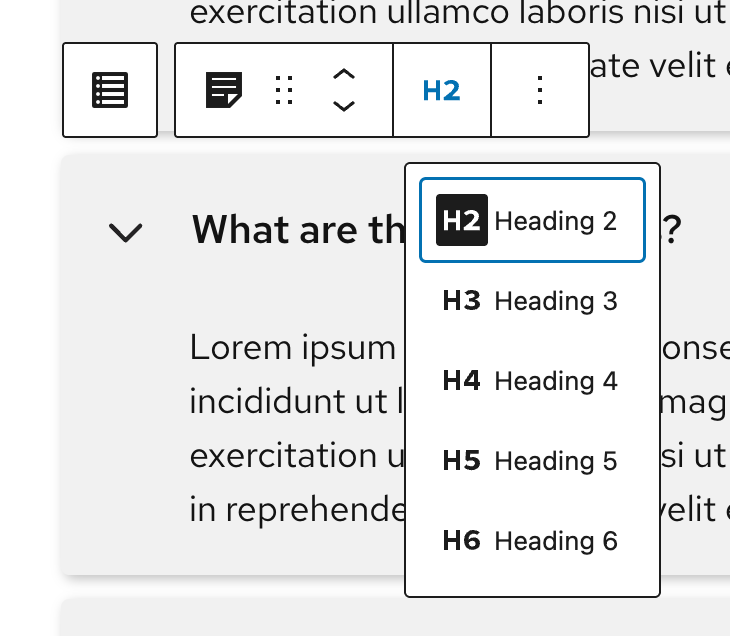
Use the Block Toolbar to update the heading level (H1-H6) of accordion titles so they follow the previous heading level and maintain correct hierarchy.
Note: Headings for the accordion do not appear in the Document Outline view in the block editor. We recommend using the WAVE browser extension to check your heading levels or the campus DuBbot scanning tool if you have access.
Link directly to an accordion item
Learn how to link to a specific accordion panel from another page in the Link Directly to an Accordion Panel or Tab Item guide.
Recommendations
Accordions can make long pages easier to scan, but hiding content isn’t always the best choice. Use this guidance to decide when an accordion adds value and when it could hurt usability.

When to use
- Break down long content into manageable sections users can expand as needed.
- Present related topics in a compact way, like FAQs or grouped resources.
- When readers only need a few key pieces of information and the rest can be “hidden.”
- When users are primarily viewing your site on mobile.
- Improve scannability, letting users see high-level headings first.

When to consider something else
- If information is essential to read. Show it on the page instead.
- If you need to link to, bookmark, or share a specific section of content. Accordion panels can’t be linked, so important information should be displayed on the page instead.
- When hiding most content would make the page look empty or require constant expanding.
- Content is short or you’re only aiming for a “cleaner” look.
- If there are only 3-4 categories but lots of content (tabs might be better).
- Content is long or complex, such as tables, large forms, or interactive elements.
- Avoid overusing accordions. Hiding too much content can make pages harder to scan and use and negatively impact page load times.
Usability and accessibility
- Limit the number of accordion items; too many can be overwhelming.
- Keep titles short and clear to make content easily scannable.
- Avoid nested accordions or tabs. These can be difficult for screen readers to navigate.
- Use caution with complex content like tables, grids, or multi-column layouts. Keep it simple.
- Follow proper heading order; adjust accordion headings so they fit into your page’s structure.
- Do not use the same title for multiple panels on a single page.