UW Tabs
Last updated:
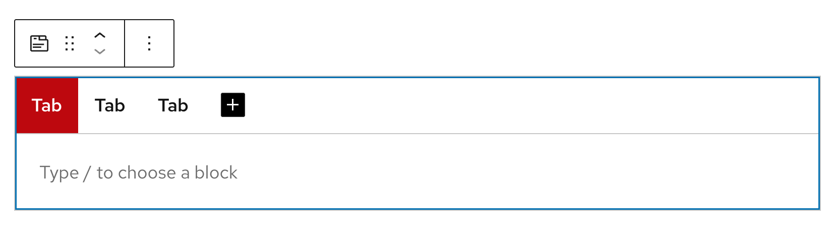
Display related content in a compact, tabbed interface. Use this to organize information into clearly labeled sections so users can quickly find and switch between topics.
On this page
Block Preview
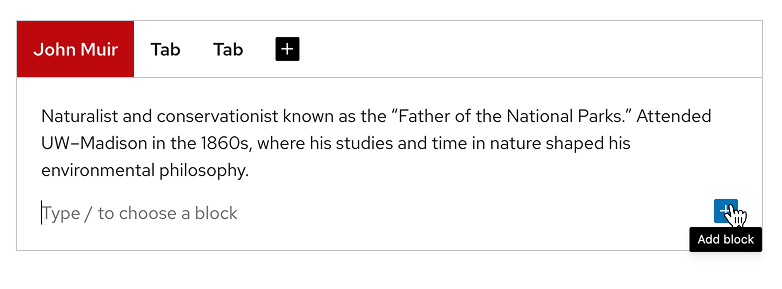
Naturalist, author, and “Father of the National Parks.” In 1860, Muir enrolled at UW–Madison, studying a broad array of subjects (chemistry, botany, geology, Latin, Greek, physics) in an “irregular” format while working odd jobs and living in North Hall. The university later awarded him an honorary degree in 1897. Muir’s first botany lesson took place under a black locust tree beside North Hall, a defining moment in his journey as a conservationist.
Playwright and activist best known for A Raisin in the Sun. Hansberry enrolled at UW–Madison in 1948, becoming the first Black woman to live in Langdon Manor, a women’s dormitory. On campus, she became politically active, working on Henry Wallace’s 1948 presidential campaign and leading the Young Progressives of America. Her time at UW helped spark her trajectory into writing and activism, though she left before graduating.
One of America’s most influential architects. Wright enrolled as a special student at UW–Madison in 1886 to study civil engineering under Professor Allan D. Conover. He took part-time classes for two semesters and worked for the university’s engineering dean, contributing to campus projects such as Science Hall. In 1955, UW awarded him an honorary Doctorate of Fine Arts.
Distinguished CBS News correspondent. Braver earned her B.A. in political science from UW–Madison in 1970. At CBS, she became known for investigative coverage of major political events, serving as chief law correspondent from 1983 to 1993, leading coverage of the Iran-Contra affair, and later serving as chief White House correspondent during Bill Clinton’s first term. Since 1998, she has been the chief national correspondent for Sunday Morning.
How to use
Insert the block
Using the Block Inserter (+ icon), search for UW Tabs and select it. You can also type /uw tabs in a new paragraph block and press Enter to add it quickly. The block starts with three tab items by default.
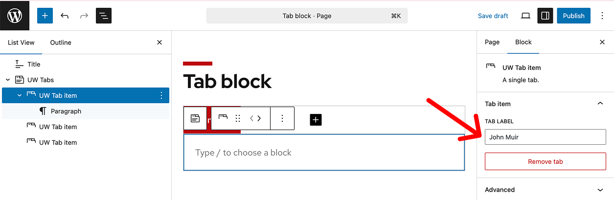
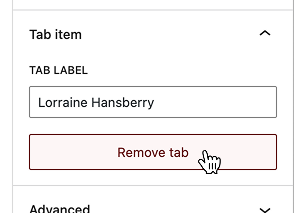
Edit a tab label
Select an individual tab in the editor or from the List View. In the block settings panel, update the Tab item label. Keep labels short and descriptive.
Add inner content
Click inside the content area of a tab to start typing, or click on Add block (+ icon) in the bottom right to add blocks (e.g., images, lists, headings).
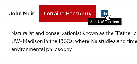
Add a new tab item
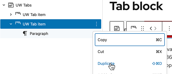
Click Add new tab item (+ icon) or duplicate an existing tab from the three-dot menu in the the List View.
Remove a tab item
Select the tab, then click the red Remove tab button in the block settings panel, or select Delete from the three-dot menu in the List View.
Reorder tab items
Open the List View to drag and drop tabs to reorder them, or use the left/right arrows in the UW Tabs block toolbar.

Link directly to a tab item
Learn how to link to a specific tab item from another page in the Link Directly to an Accordion Panel or Tab Item guide.
Recommendations

When to use
- To group related content into clearly labeled sections.
- When each section can stand alone and be read in any order.
- When you have 3–6 sections that fit on a single row.

When to consider something else
- If you have only one or two sections. Display them directly on the page instead.
- If all content is essential to read or sections depend on each other to be understood.
- If you need to display complex layouts like large tables, grids, or multi-column designs inside each section.
Usability and accessibility
- Keep labels short (one to two words), scannable, and in plain language.
- Keep the number of tabs between 3-6 so they fit on one row.
- Avoid ALL CAPS, punctuation, and emojis in tab labels.
- Don’t nest tabs or accordions inside other tabs. Screen reader users may get stuck or lose track of which sections are open.
- Don’t use tabs for navigation between pages. They only organize related content on one page and aren’t recognized by screen readers as menus.