Creating header and footer menus
Last updated:
UW Theme 2.0 uses WordPress’s built-in Menus system to manage header and footer menus, not the newer Navigation block you may see in WordPress documentation.
This means you assign menus to specific locations in the theme, such as the primary header navigation or individual footer columns, from the WordPress admin rather than the block editor.
Menu options in UW Theme
There are three different areas in UW Theme where you can display menus.
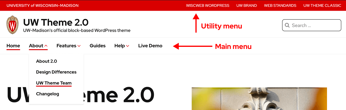
Header menus
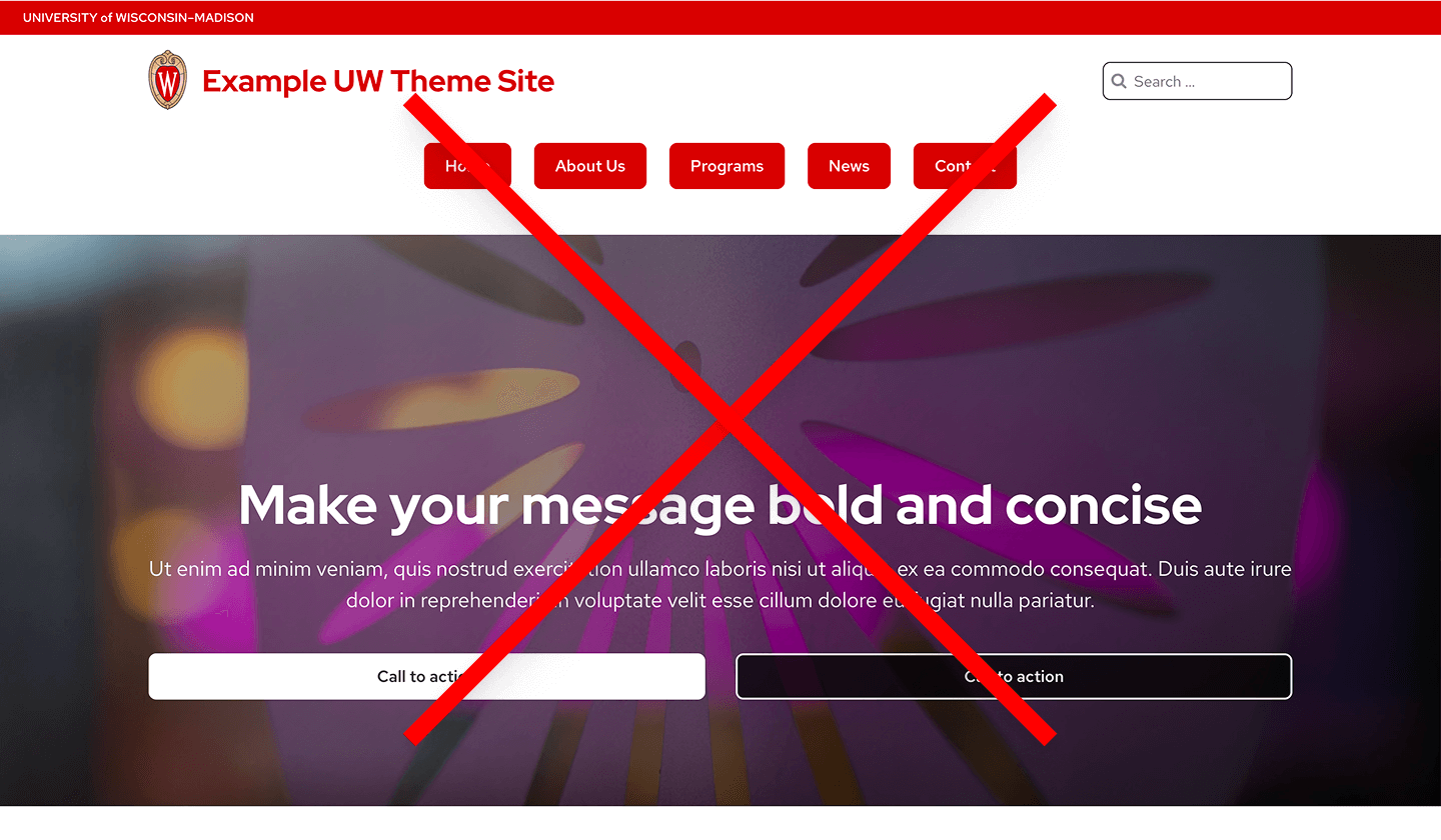
- Main menu: Primary site navigation in the header in a horizontal bar (below the site title).
- Utility menu: Secondary links in the header (upper-right corner of your site)
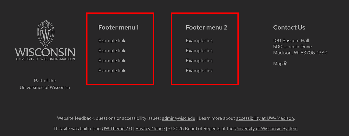
Footer menus
One or two menus displayed in the footer (selected in Theme Settings > Footer tab).
How to create a menu in the UW Theme
WordPress often recommends building menus with the Navigation block in newer versions of WordPress. The Navigation block is not enabled in UW Theme 2.0.
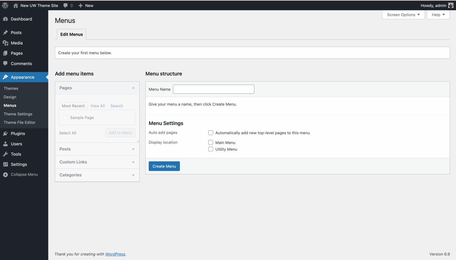
Instead, you create and manage menus in the Appearance > Menus screen in the WordPress dashboard. Use the official WordPress Menu User Guide for detailed steps to:
- Create a menu
- Add, remove, and reorder items
- Create submenu items (dropdowns)
Display header menus
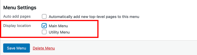
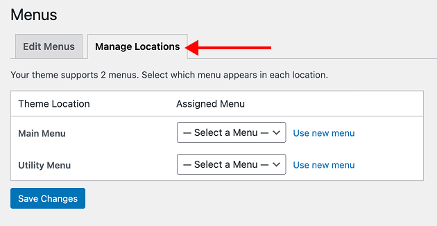
After you create a Main menu or Utility menu, add your new menu to one of the two Theme Locations in the Appearance > Menus screen:
- Find Display location option under Menu Settings at the bottom of the screen.
- Click the checkbox for the location where you want your menu to appear: Main Menu or Utility Menu
- Click Save Menu once you’ve made your selection.
Alternatively, you can select display locations under the Manage Locations tab. Always save changes to apply them to your site.
Reverse menu colors
You can swap the background colors (from red to white and vice versa) used for the Main Menu and Utility Menu. Go to the Colors tab in Theme Settings to reverse these colors.
Display footer menus
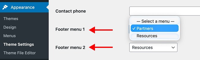
You can add up to two menus in your site’s footer. These menus are useful for quick links to important pages, such as About, Policies, or Resources. Keep each menu short, four to eight items, for easy scanning.
How to set them up:
- Create your menus under Appearance > Menus
- Select your menus in the Footer tab of the Theme Settings page and assign them to Footer column 1 or Footer column 2
- The name given to your footer menu will appear as the header
More footer options in Theme Settings
Visit the Footer section of the Theme Settings guide to learn about additional footer options like adding social media links and contact information.
Best practices
Content guidelines
- Use clear, scannable labels (avoid internal jargon).
- Make labels as short as possible to convey the necessary information, but don’t be wordy.
- Choose descriptive labels over generic ones. For example, “Student Services” instead of “Services.”
- Avoid overly conversational labels in attempt to be friendly and approachable.
- Avoid having the navigation break on multiple lines.
- Avoid trying to “fix” a long menu by hiding critical items; keep what users need visible and understandable.
- Order items by importance and what users need most (not automatically alphabetical).
- Avoid long dropdowns that require scrolling.
- Do not use uppercase text for your Main Menu and Footer labels to ensure your content is readable and accessible; this design is used only in the Utility Menu as part of the UW Brand and to reinforce their secondary hierarchy in relation to your main menu.
Main Menu (primary navigation)
- Use 4–8 top-level links as a general guide. More can be okay if labels stay clear and the menu doesn’t wrap onto a second line.
- Do not use buttons, tabs, or a group of links in place of your main navigation. This can negatively impact your Search Engine Optimization and make it difficult for users to navigate your site.
- Include an explicit Home link as your first menu item even though the UW Crest logo links to the homepage. This is something users often expect and works as a helpful fallback if users are confused.
Utility Menu (secondary navigation)
Keep utility menus short (about 3–6 links) and task-focused (secondary actions/tools) like Directory, Contact, Give, Apply, etc.
Footer Menus
- Use 4–8 items per column for easy scanning as a general guide.
- Treat the footer as a legitimate navigation area: it’s common, expected, and useful, but it should be structured (not a dumping ground).
- Avoid turning the footer into a full site map if it becomes unwieldy; keep it readable and purposeful.
- Ensure your footer menus are clearly labeled so the footer is easy to scan (Resources, Quick Links, Partners, etc).
Quick menu validation
To quickly validate your menus, ask someone to find a common page using only the menu. If they hesitate, adjust labels/grouping before adding more links. 3-5 people is best to find consistent themes, but if you’re low on time, some data is always better than none.
Additional resources
- Utility Navigation: What it is and how to design it (Nielsen Norman Group)
- Navigation articles and videos (Nielsen Norman Group)
- Menu-design checklist: 17 UX guidelines (Nielsen Norman Group)
- Footer usability guidance (US Design System)
- Footers are underrated (Nielsen Norman Group)
- Footers 101 (Nielsen Norman Group)