Columns block
Last updated:
Use the WordPress Columns block to place text, images, and other content side by side in up to six columns. Adding multiple Columns blocks on top of each other creates a grid-like layout if the Grid block is too complex for your needs. For predictable proportions like 50/50 or 60/40, Columns is the right choice.
Not sure if Columns is the right block? See Choosing a layout block.
Video overview
Block settings
For a full overview like color, type, and spacing, visit the Columns block documentation on WordPress.org.
In the block settings sidebar, below are the most commonly used options for Columns in UW Theme.
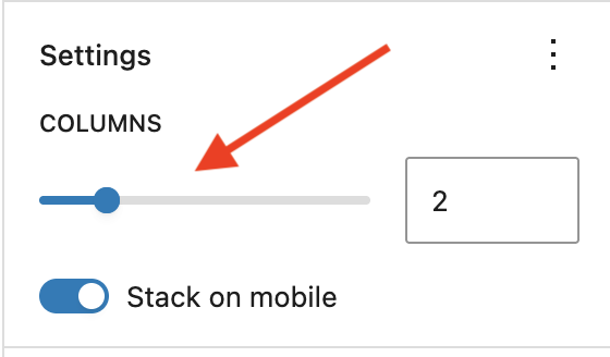
Columns block settings
- Columns slider: Change the number of columns. If you reduce the number of columns, any content inside of the removed columns will be deleted. Use Undo in the Top Toolbar if this happens.
- Stack on mobile: Ensures content stacks properly on mobile. Avoid disabling unless you have a specific reason.
Individual column settings
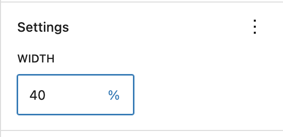
You can set the width of individual columns using the Column width field in the block settings sidebar when a Column (not Columns) block is selected. If you set the width of only one column, the remaining columns grow to fill the available space.
Mobile stacking order
On mobile, columns stack top to bottom in the same order they appear left to right on desktop. The left column appears first, then the next column, and so on.
If you need a different stacking order on mobile — for example, showing an image above the text — use the Media & Text block instead, or start from a pattern designed for that layout. If the order of your content matters, preview the page on mobile using the editor’s View feature.
Best practices
Following these recommendations when setting up a column layout:
- Stick to the preset column layout that Columns provides when first adding the block to the page, like 50/50, 33/33/33. They’re easier to manage and less likely to cause unexpected layout issues.
- If you reduce the number of columns, any content inside the removed columns will be deleted. Use the Undo button in the Top Toolbar if this happens.
- Stick to four columns or less in a single row to keep content readable. More columns means less space for each grid item.
- Use Wide Width alignment in the block toolbar when displaying more than two columns. Visit the Managing content width guide for more information.
Examples
Use Group to create a full-width content section with a background color that helps break up a page visually. This section groups together an H2 heading with the Red Mini Bar enabled, and the image, paragraph, and button blocks.
Simple three columns
This is a simple three-column layout made with the Columns block. It uses the built-in three equal columns (33/33/33) preset and is set to Wide width.

Spring

Summer

Winter
66/33 sidebar layout (UW Theme pattern)
This UW Theme pattern under the Link category uses a 66/33 Columns layout with a main content area on the left and a jump links sidebar on the right.
This is my first h2 heading
Visit WordPress.org documentation for guidance on adding anchor links in the right-hand sidebar that let users jump to specific sections of the page. Lorem ipsum dolor sit amet, consectetur adipiscing elit, sed do eiusmod tempor incididunt ut labore et dolore magna aliqua. Ut enim ad minim veniam, quis nostrud exercitation ullamco laboris nisi ut aliquip ex ea commodo consequat. Duis aute irure dolor in reprehenderit in voluptate velit esse cillum dolore eu fugiat nulla pariatur. Excepteur sint occaecat cupidatat non proident, sunt in culpa qui officia deserunt mollit anim id est laborum.
Sed ut perspiciatis unde omnis iste natus error sit voluptatem accusantium doloremque laudantium, totam rem aperiam, eaque ipsa quae ab illo inventore veritatis et quasi architecto beatae vitae dicta sunt explicabo. Nemo enim ipsam voluptatem quia voluptas sit aspernatur aut odit aut fugit, sed quia consequuntur magni dolores eos qui ratione voluptatem sequi nesciunt.