Grid block
Last updated:
Use the WordPress Grid block when you need repeating cards or content arranged across multiple rows. Grid arranges blocks in a repeating layout with even spacing, making it a good choice for equal height cards.
Grid also lets you resize individual items so they take up more or less space. This lets you create a grid where some items are wider or taller than others while keeping the overall layout structured.
Not sure if Grid is the right block? See Choosing a layout block.
Block settings
These are the most common settings you’ll use when working with the Grid block.
For a full overview of all available settings like layout, color, and type, visit WordPress’s official Grid block documentation.
Column options
You can adjust how many items appear in each row of a Grid block. Select the Grid block and open the Layout settings in the block settings sidebar.
How many columns appear depends on three things: Max. columns, Min. column width, and the Grid block’s content width.
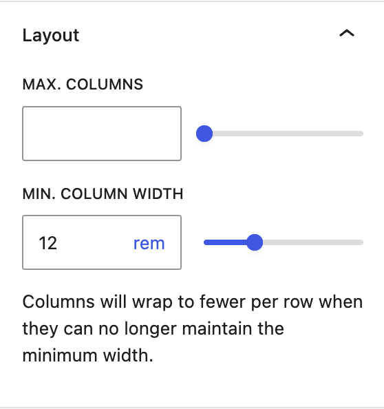
Max. columns
Limits how many columns can appear in one row
- Decrease this value if you want to limit the grid to fewer columns.
- Increase this value if you want to allow more columns.
Important mobile warning
If you set Max. columns, also set Min. column width so the grid can adjust on smaller screens like tablet and mobile phones. If you only set Max. columns, the columns may will stay fixed and make grid items appear too narrow and difficult to read.
Min column width
Controls when the grid wraps to fewer columns on smaller screens.
- Increase this value if items feel cramped.
- Decrease this value if the grid wraps to fewer columns too soon.
Grid block width
Controls how much horizontal space the Grid block has available.
- Use a wider width alignment when grid items need more room.
- Use a narrower width alignment when you want the grid to take up less space.
Transform to Group, Row, or Stack
Grid block is a variation of the Group block. You can transform it into a Row, Stack or Group block at any time without losing content in the block setting sidebar. This means you can start with one layout block and switch if your needs change.
Learn how to transform the Grid block (WordPress.org).
Best practices
Following these recommendations when setting up a grid layout:
- Start with a UW Theme pattern for grid layouts to save time and effort.
- Set the Grid block to use Wide width alignment when displaying 3 or more columns so content has enough room and is easy to read.
- Stick to 4 columns or less in a single row to keep content readable. More columns means less space for each grid item.
- Test your layouts on mobile before publishing using the WordPress View feature.
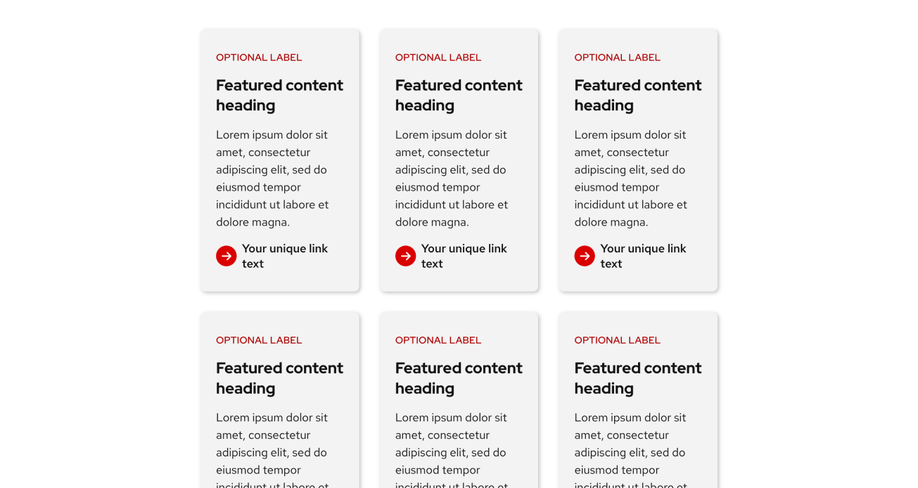
Don’t do this
Three columns at the default (“None”) content width. Content becomes squished and difficult to create.
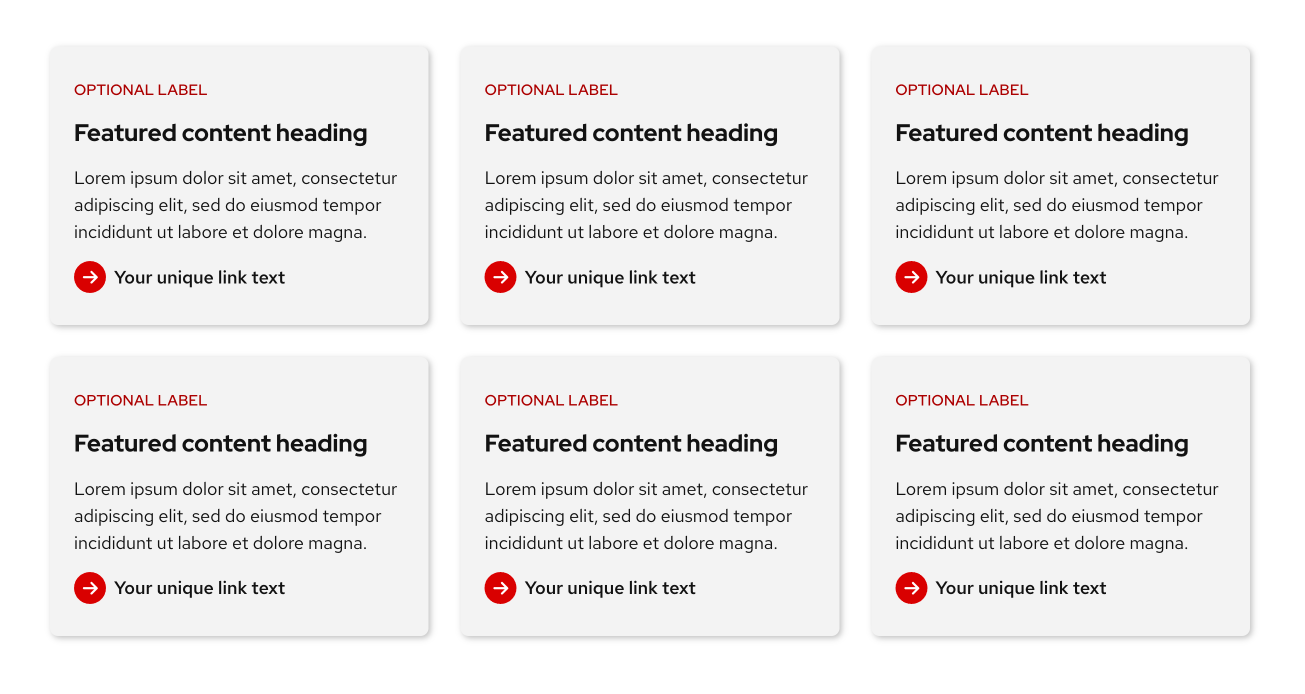
Do this
Three columns at the theme’s wide width. Content has enough room to be read clearly.
What’s happening behind the scenes
The Grid block uses the Grid CSS layout property which is why content inside behaves differently than the flexbox based Row and Stack blocks. If you are interested in learning more about Grid in CSS, visit MDN: CSS Grid layout
Examples
Basic Grid
This example shows equal height cards built with the Grid block. Each card is created using the Stack block. Refer to patterns in the UW Theme for more card examples.

Featured content heading
Lorem ipsum dolor sit amet, consectetur adipiscing elit, sed do eiusmod.
Featured content heading
Lorem ipsum dolor sit amet, consectetur adipiscing elit, sed do eiusmod tempor incididunt ut labore et dolore magna. Lorem ipsum dolor sit amet, consectetur adipiscing.
Featured content heading
Lorem ipsum dolor sit amet, consectetur adipiscing elit, sed do eiusmod tempor incididunt ut labore et dolore magna.
Featured content heading
Lorem ipsum dolor sit amet, consectetur adipiscing elit, sed do eiusmod tempor incididunt ut labore et dolore magna.
Featured content heading
Lorem ipsum dolor sit amet, consectetur adipiscing elit, sed do eiusmod tempor incididunt ut labore et dolore magna.
Featured content heading
Lorem ipsum dolor sit amet, consectetur adipiscing elit, sed do eiusmod tempor incididunt ut labore et dolore magna. Lorem ipsum dolor sit amet, consectetur adipiscing.
Advanced Grid
This example uses a 4-column Grid with Cover blocks to create each card with a background image. A few cards are resized to span 2 rows to create a more dynamic masonry-style layout. To ensure text stays readable and accessible, an overlay is applied to each Cover block at 80% opacity.
Watch the WordPress Using the Grid block tutorial to learn how to achieve this layout.
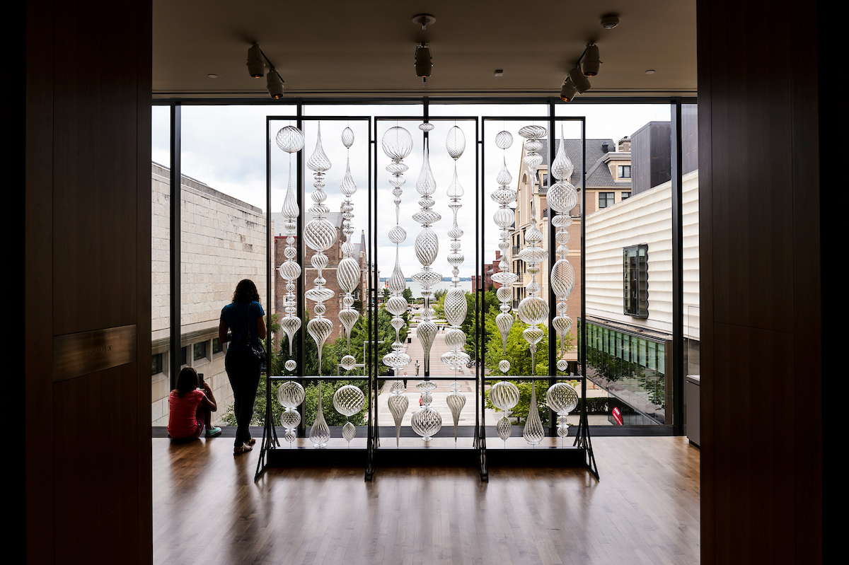
“Optic Twist Screen #2” blown glass sculpture
Chazen Museum, 2018
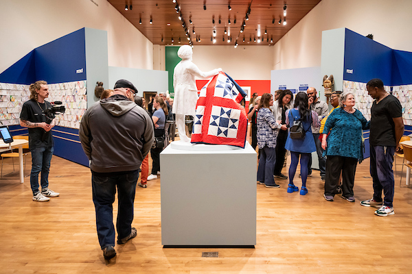
“Remancipation” exhibit
Chazen Museum, 2023

“The Mendota Wall” glass sculpture
Kohl Center Foyer, 2025

Neon glass scultpure
Neon Light Show, 2018

Student advanced painting studio
Annual Open Studio Day, 2024
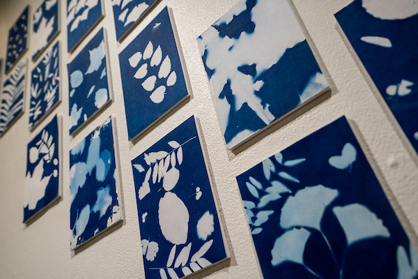
Fall leaves cyanotypes
Art Lofts Gallery, 2025

“Sifting and Reckoning” exhibit
Chazen Museum, 2022

Manabu Ikeda pen and ink
Chazen Museum, 2015

“The Monarch” senior class statue
Memorial Union, 2019
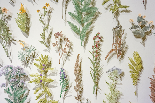
“Suspended Landscapes” fiber arts exhibit
Chazen Museum, 2022