
Design differences in 2.0
UW Theme 2.0 design changes
UW Theme 2.0 brings refreshed layouts and updated styling across campus websites. While the UW look and feel remains familiar, you may notice a few visual differences that align more closely with current UW brand standards and WordPress best practices.
This page highlights some of the key design changes from UW Theme Classic to UW Theme 2.0.
Alternating Content
In UW Theme Classic, alternating content boxes stacked tightly on top of one another, which sometimes made long pages feel dense and continuous.
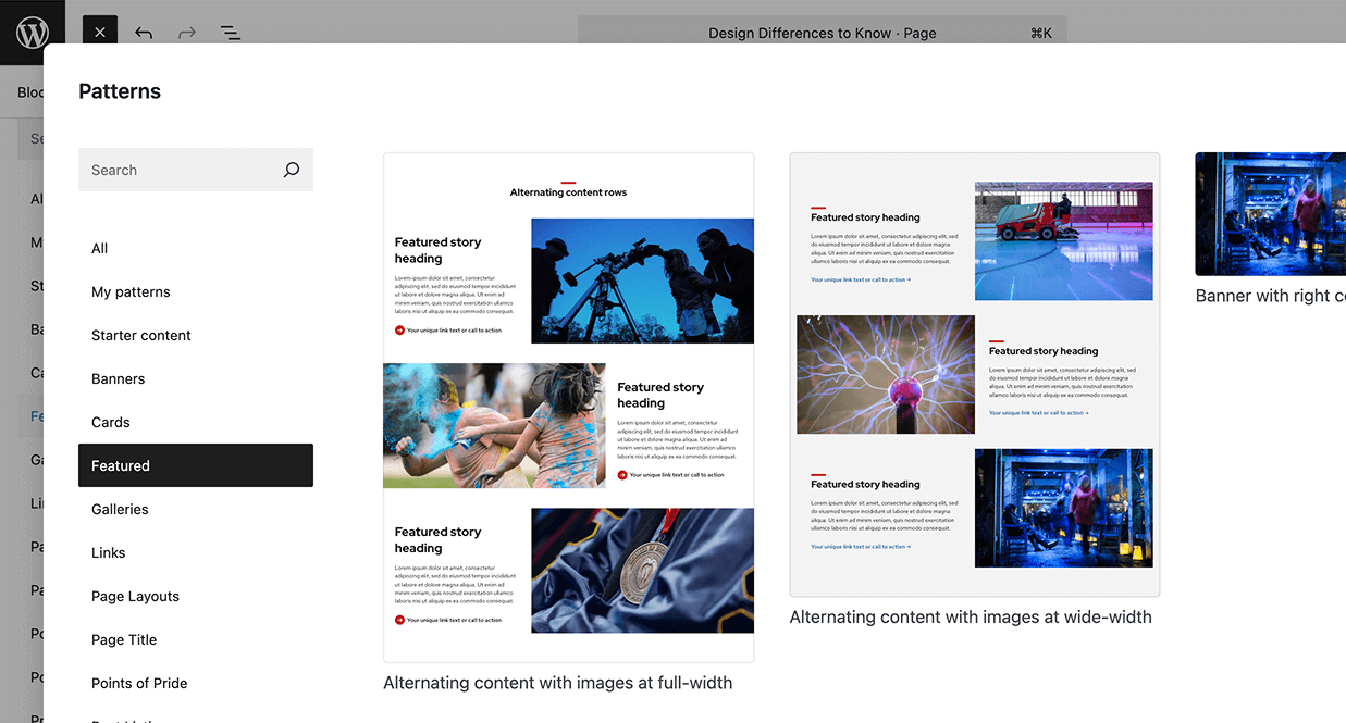
In UW Theme 2.0, there’s no longer a dedicated Alternating Content element. Instead, you can create this style using pre-made patterns that the theme provides. These updated patterns include more space between each row of alternating content.
This subtle design change helps:
- Improve readability and scanning on longer pages.
- Give each row room to breathe while keeping a consistent rhythm.
- Visually connects each image-and-text pair as a clear section.
If you previously used pre-defined menus to populate links in Alternating Content, see Pre-defined Menus section below for an alternative method in UW Theme 2.0.
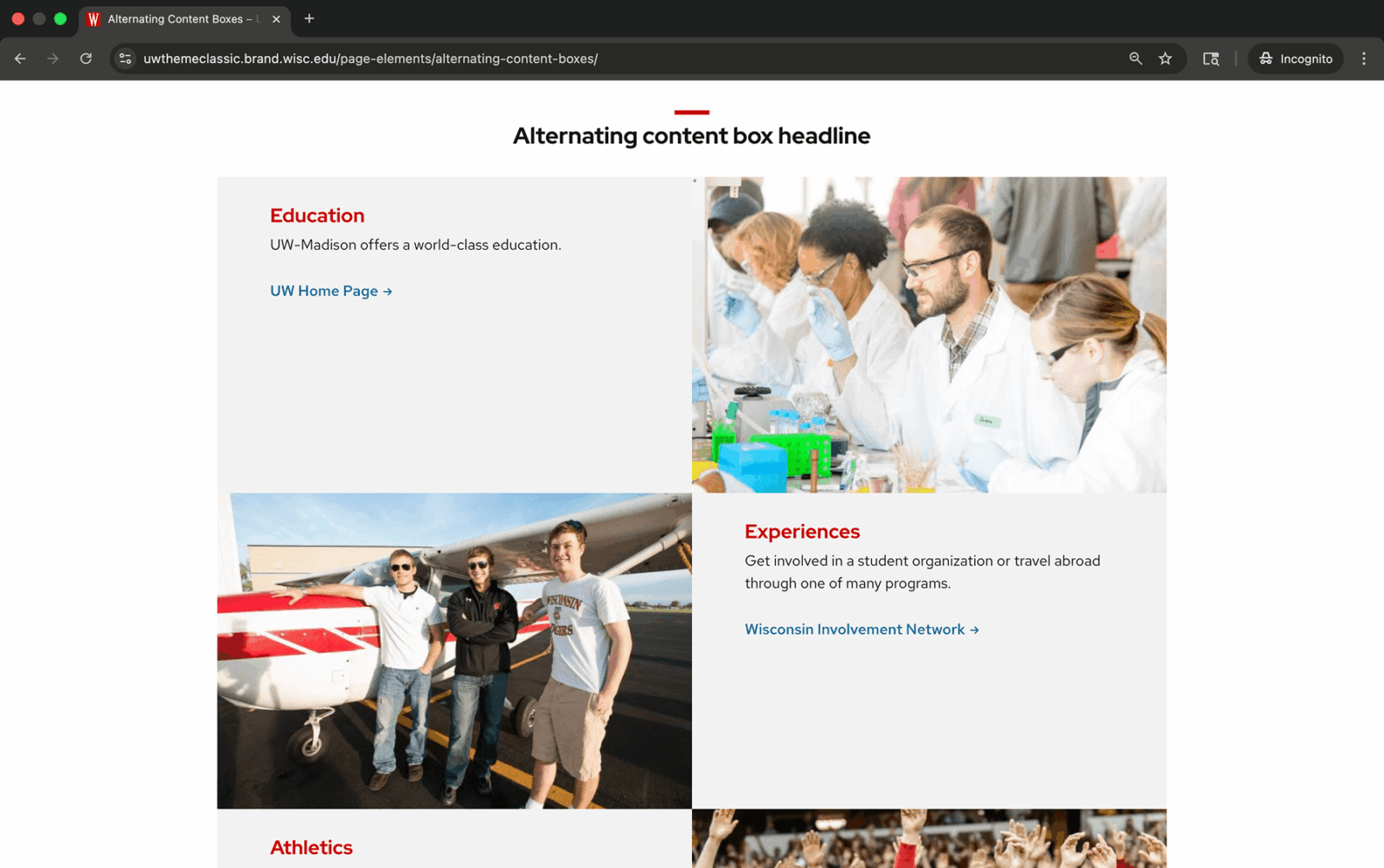
UW Theme Classic

UW Theme 2.0
Creating Alternating Content in UW Theme 2.0
In UW Theme 2.0, alternating content layouts are created using patterns rather than a block. You can find these layouts under the Featured pattern category, which includes some pre-made designs for alternating images and text. Visit the patterns overview for more information.
Breadcrumbs
In UW Theme Classic, if a site included a hero image or carousel at the top of the page, breadcrumbs would display below the hero area.
In UW Theme 2.0, they’ve been moved to always appear directly below the main navigation and above the hero area.
This change began as a limitation of the block editor but follows a common design pattern on the web. Grouping breadcrumbs closer to the main navigation keeps navigational elements together, which may improve wayfinding and make it easier for users to understand where they are within a site’s structure.
You can enable or disable breadcrumbs in Theme Settings under the Sitewide tab.
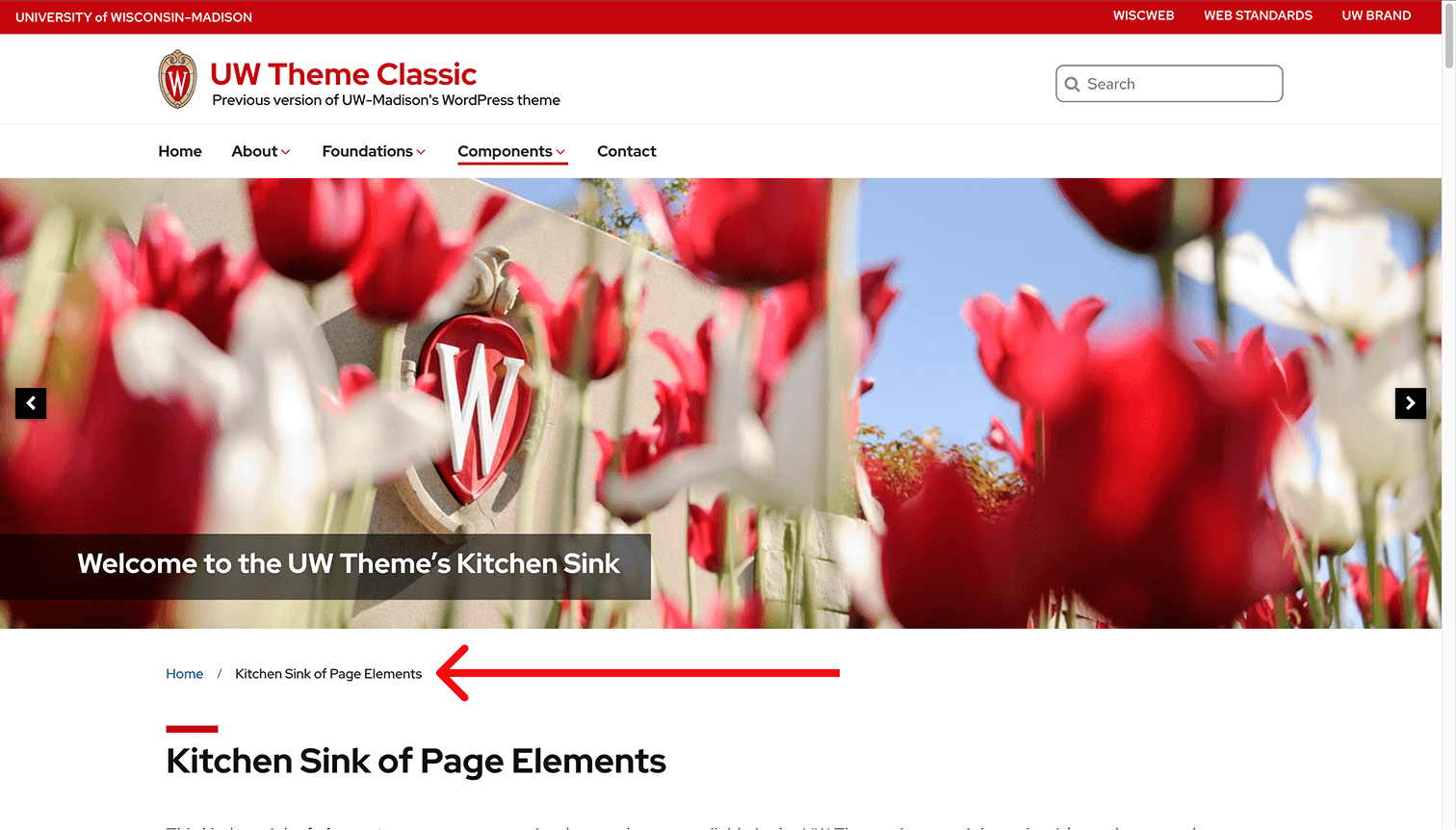
UW Theme Classic
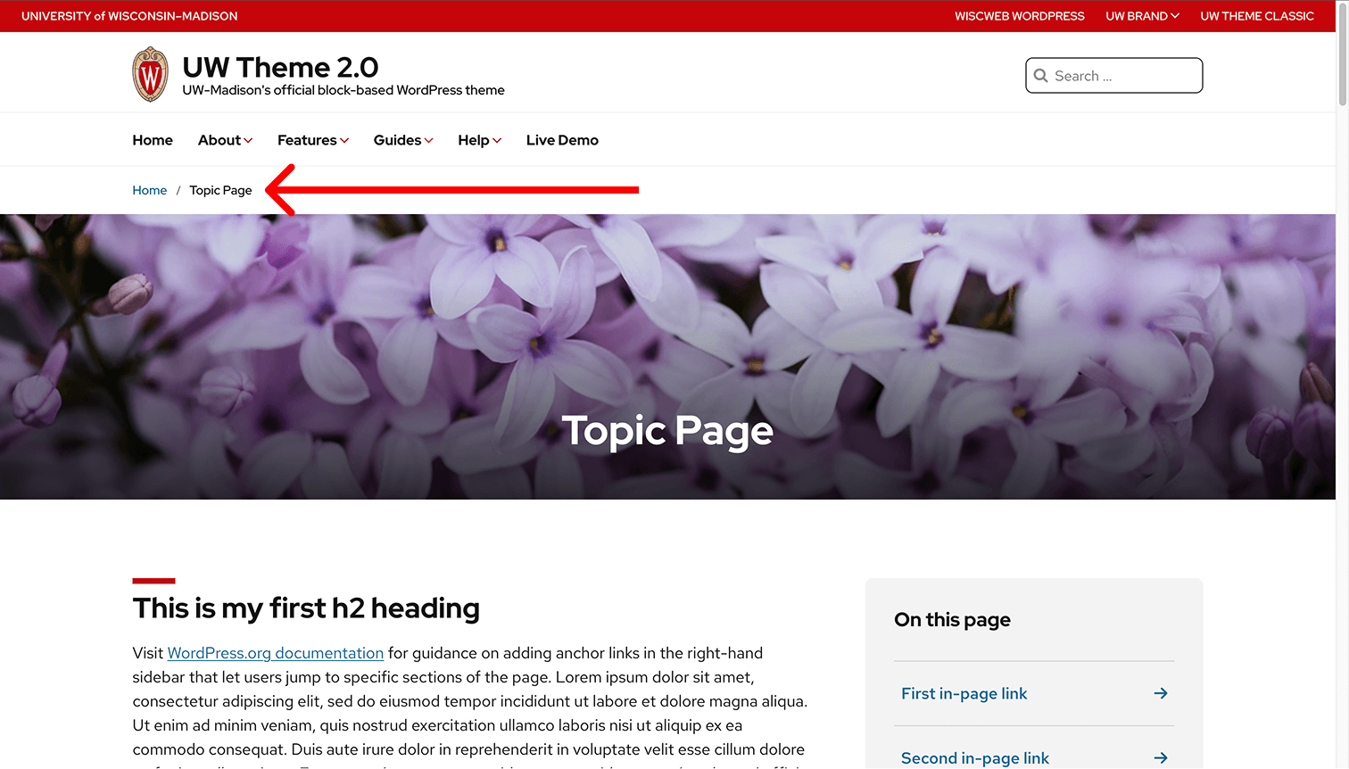
UW Theme 2.0
UW Card Style
In UW Theme Classic, users could turn on the UW Card Style option for certain blocks. This added a red bottom border to create a card-like appearance. Users could also turn on an optional drop shadow to create a raised card effect.
In UW Theme 2.0, this works differently. The red border has been removed for a cleaner, more contemporary look, and cards are now created using patterns. Drop shadows can be applied to many design blocks as needed, giving users more flexibility and consistency across layouts.

UW Theme Classic

UW Theme 2.0
Creating cards in UW Theme 2.0
Start by browsing the Cards patterns category to find a layout that fits your content. These patterns use standard WordPress Core blocks (blocks not made by the UW Theme) and include consistent spacing, link styling, and shadow options built in.

Featured images on posts
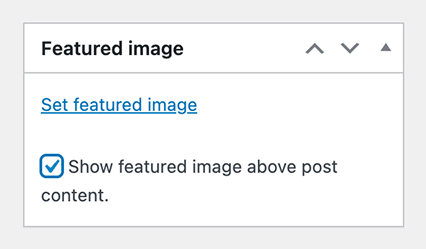
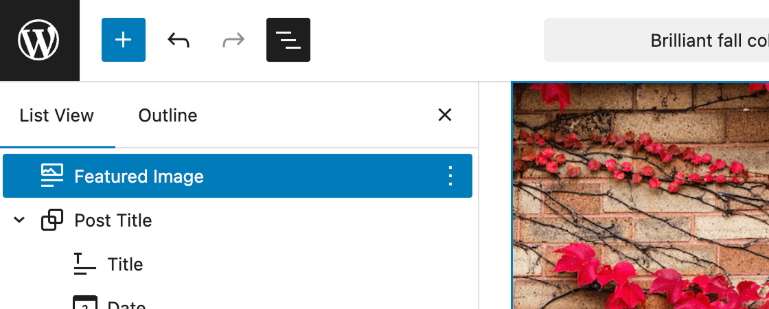
In UW Theme Classic, users could set a featured image in the sidebar and automatically display it above post content.
In UW Theme 2.0, setting a featured image and displaying it are separate steps:
- Set the featured image in the Page/Post Settings sidebar.
- Add the Featured Image block to control where it appears on the page.
Once added, you can move the Featured Image block above or below the post title like any other block. Visit the Block Fundamentals guide to learn more about adding and moving blocks.
UW Theme Classic
UW Theme 2.0
Group of Links
In UW Theme Classic, group of links included a card-like background and only one arrow style.
In UW Theme 2.0, the design adds more spacing, introduces additional arrow style and color options, and removes the card styling for a simpler, more consistent look.
New in 2.0, the UW Group of Links block provides the following:
- Option to display links in up to three columns, when the container is wide enough.
- Updated arrow styles that can be turned on or off.
- Subtle hover animations for clearer interaction feedback.
If you previously used pre-defined menus to populate links, see Replacing pre-defined menu links below for an alternative method in UW Theme 2.0.
UW Theme Classic

UW Theme 2.0
Group of Links as Buttons
Unlike UW Theme Classic, the Group of Links block in UW Theme 2.0 does not include an option to style links as buttons. You can use the Buttons block to create a group of buttons instead. We recommend checking the pattern library first to see if there’s already a layout that meets your needs and saves time.
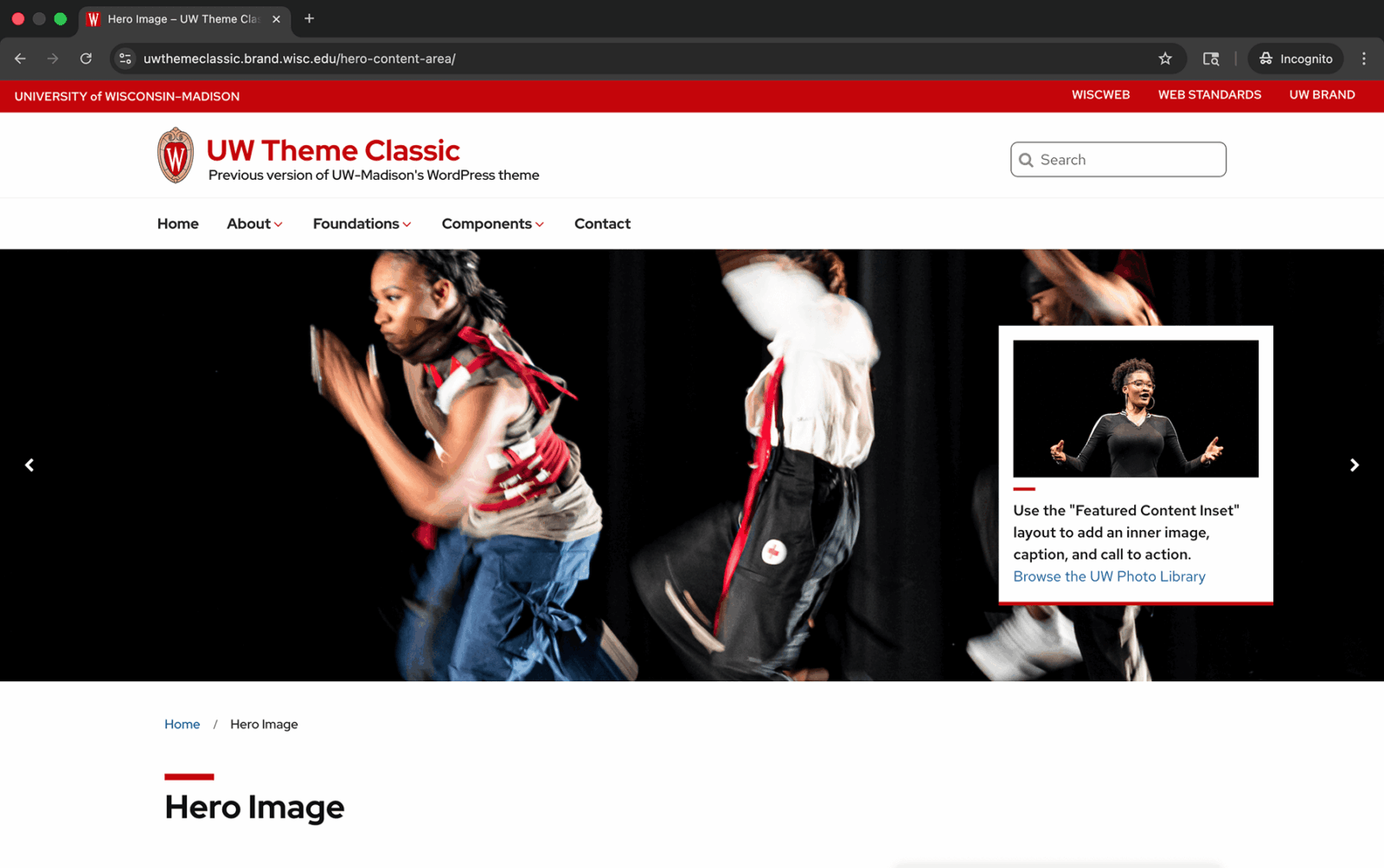
Hero Area
In UW Theme Classic, the hero area was a fixed section that allowed a single image with optional text over it. When multiple images were added, the hero automatically became a carousel.
In UW Theme 2.0, the hero area has been replaced with a wide selection of banner patterns and a separate UW Hero Carousel block.
One variation in UW Theme Classic, called Hero Content Inset, placed an image and text inside a card-style box over the hero image. This option is no longer available in UW Theme 2.0. The design was simplified to better align with the updated UW Theme 2.0 style and to reduce the complexity that can come with layering multiple images together.
UW Theme Classic

UW Theme 2.0
Creating hero content in UW Theme 2.0
Browse the Banners patterns category for a wide variety of pre-made hero and banner layouts, ranging from simple banners to designs with text overlays, buttons, and alignment options. You can also use the UW Hero Carousel block to feature multiple rotating images at the top of a page.
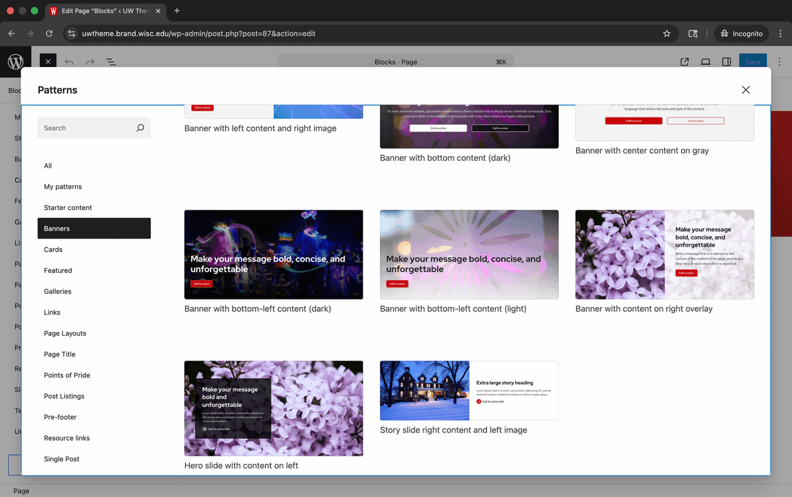
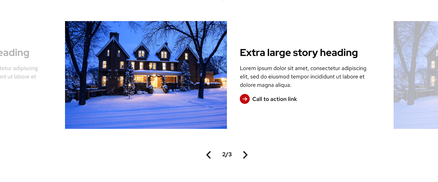
Image and Content carousel
In UW Theme Classic, the Image and Content Carousel displayed a sliding panel with an image on one side and text on the other, set against a red background.
In UW Theme 2.0, this block has been redesigned and renamed as the UW Story Slider to better communicate its purpose: telling a sequential story where each image supports or enhances the accompanying content.
The new design removes the red background in favor of a cleaner, more balanced layout so that imagery and content can shine. Optional preview slides let users see what’s coming next or revisit previous slides, creating a more engaging and connected storytelling experience.

UW Theme Classic
UW Theme 2.0
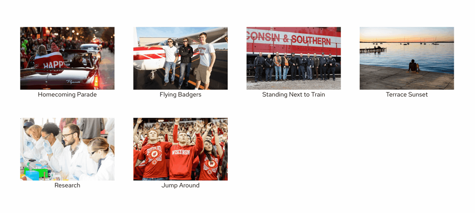
Image galleries
In UW Theme Classic, the Image Gallery element displayed photos in a simple grid layout with tight spacing and captions shown below each image. In UW Theme 2.0, galleries now use the WordPress Core Gallery block, which has a different visual design.
In the Gallery block, captions overlay images instead of displaying below and feature larger thumbnails. If a caption is added for the entire gallery, it appears beneath the full set of images.
These updates come directly from WordPress Core, giving users a familiar editing experience while maintaining a clean look within the UW Theme.
UW Theme Classic

UW Theme 2.0
List spacing
In UW Theme Classic, the spacing between list items was wider by default, with an optional tightly spaced style available.
In UW Theme 2.0, lists are created using the WordPress Core List block, which uses a more compact default style for easier reading and cleaner alignment with surrounding text.
Users can still adjust spacing by selecting the More Space option in the block settings, which increases vertical spacing between list items.
Example of a List block with default space:
- Aliquam tincidunt mauris eu risus.
- Vestibulum auctor dapibus neque.
- Nunc dignissim risus id metus.
- Cras ornare tristique elit.
- Vivamus vestibulum ntulla nec ante.
Example of a List block with more space applied:
- Aliquam tincidunt mauris eu risus.
- Vestibulum auctor dapibus neque.
- Nunc dignissim risus id metus.
- Cras ornare tristique elit.
- Vivamus vestibulum ntulla nec ante.
Faculty/Staff Listing
In UW Theme Classic, this plugin was called Faculty/Staff Members and and the page element for listing team members was Faculty/Staff Listing.
In UW Theme 2.0, the Faculty/Staff Members plugins has been renamed to UW People, and the Faculty/Staff Listing has been renamed the UW People Listing block.
This new block has been expanded to include a wider range of layout options, like a card style layout and circle images. Visit the UW People plugin page and the UW People Listing block page to learn more about what’s possible.
Advanced search filter
In UW Theme Classic, the advanced search filter displayed the heading Filter Results. This visible heading has been removed in UW Theme 2.0 for a cleaner layout. Each filter input includes its own label for clarity, and the filter section continues to provide the same functionality as before.

UW Theme Classic

UW Theme 2.0
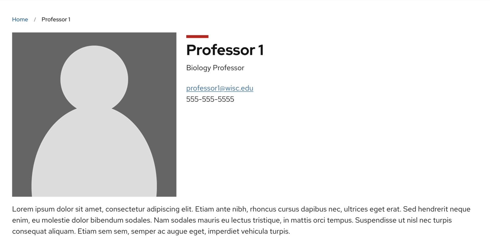
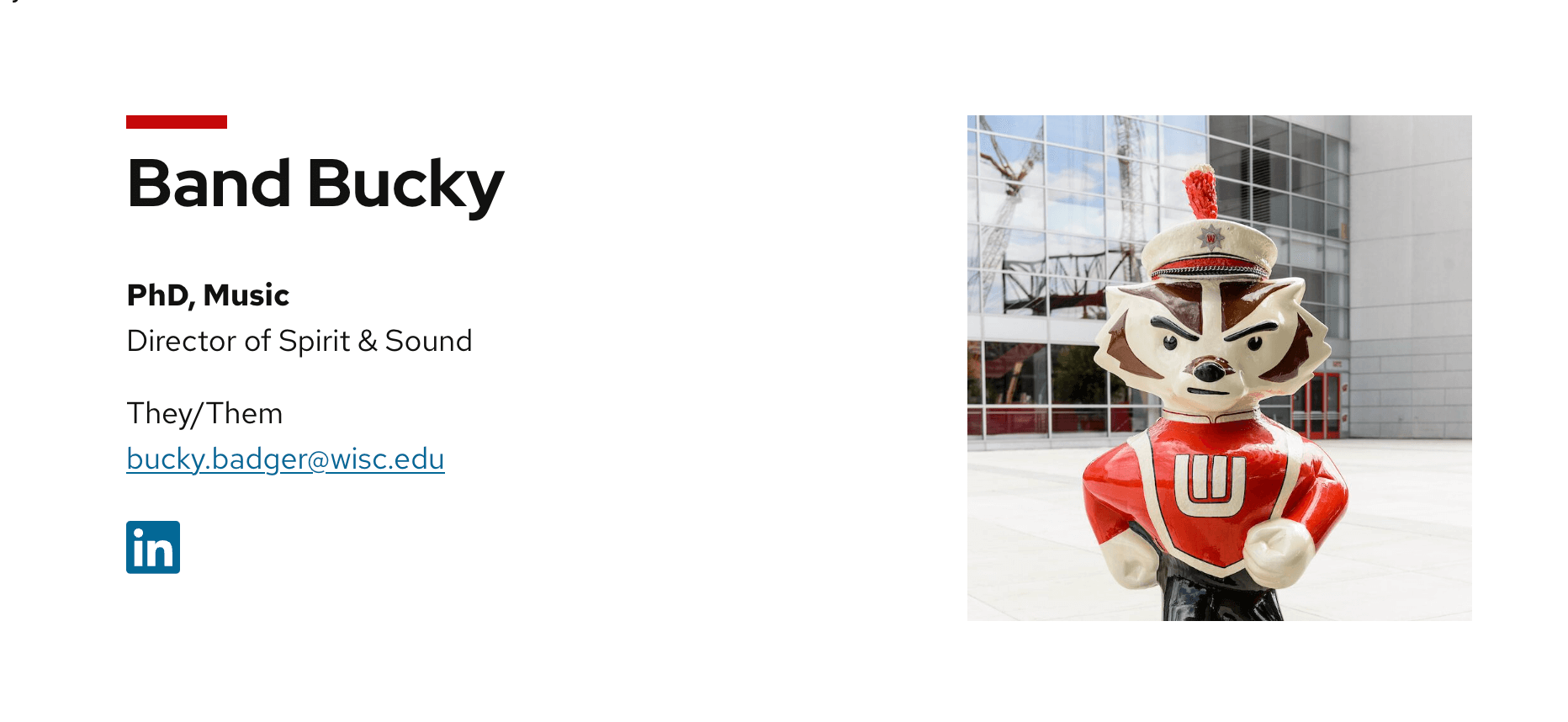
Profile photos are positioned on the right
In UW Theme Classic, profile images on individual people pages appeared on the left with details on the right. In UW Theme 2.0, profile images now appear on the right with details on the left.
UW Theme Classic
UW Theme 2.0
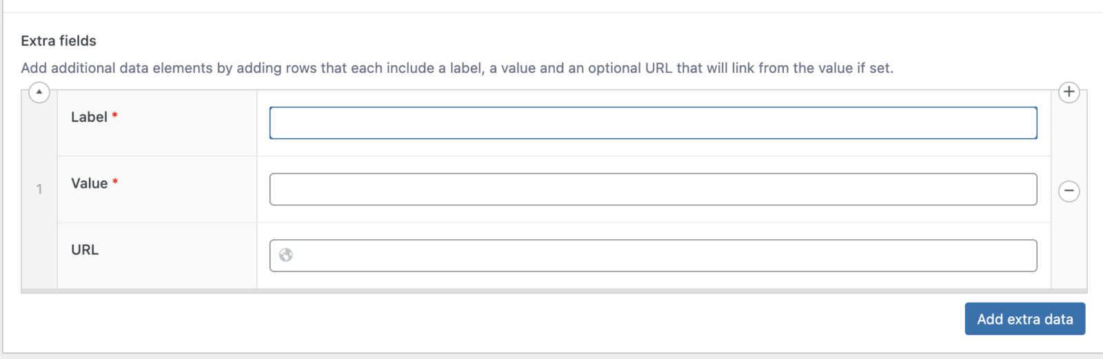
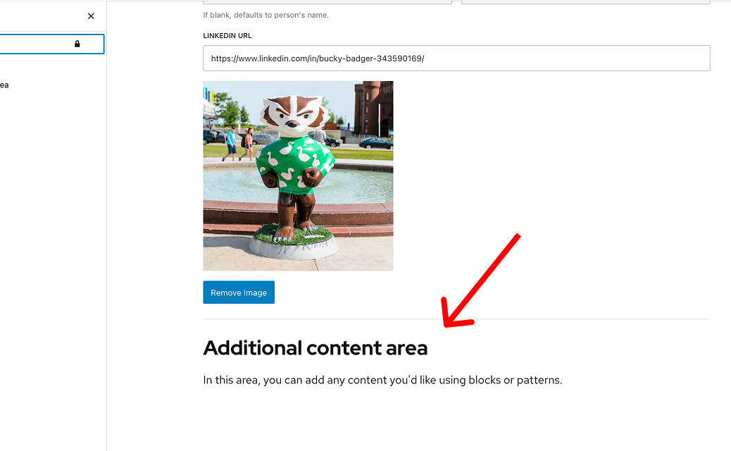
Extra fields for person details
In UW Theme Classic, extra fields were added near the profile image. In UW Theme 2.0, you add that content below the main profile fields using blocks and patterns.
UW Theme Classic
UW Theme 2.0
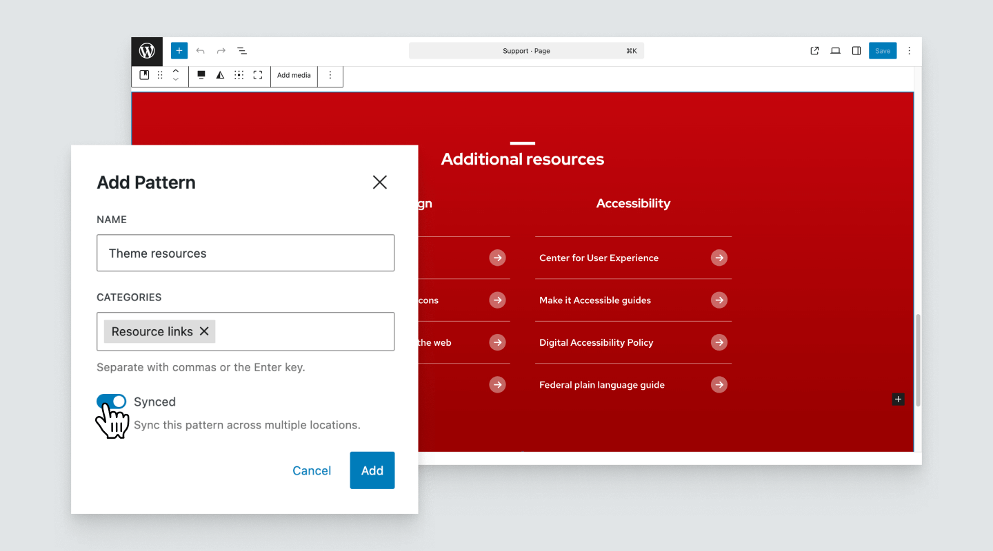
Custom menus
In UW Theme Classic, users could populate links in elements like Alternating Content and Group of Links by selecting a custom menu, which automatically pulled in links created under Appearance > Menus in the WordPress admin.
UW Theme 2.0 blocks do not support this feature. Instead, you can create a Synced Pattern that contains a group of links. Any time you update that pattern, the changes automatically appear everywhere the pattern is used — offering a similar outcome.
Quote styles
In UW Theme Classic, two quote styles were available: Stylized Quote and Blockquote.
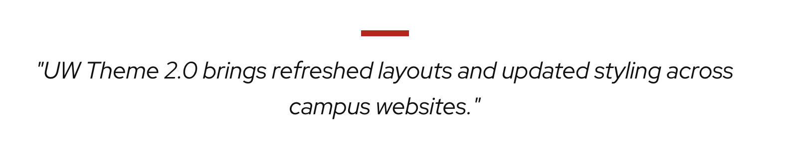
In UW Theme 2.0, these have been renamed and refreshed as Pull Quote and Block Quote, both available through the UW Quote block.
The Pull Quote now uses larger default text with a red accent line and quote icon, while the Block Quote features a more minimal style with italics and a gray left border. The red border previously used in the Blockquote has been removed to draw more focus to the quote itself and discourage using this style to emphasize regular text, which can cause confusion and accessibility issues for screen reader users.
Pull Quote style
Pull quotes are used to highlight a short, impactful statement or excerpt. The quote content is pulled from text that already appears within the article or page to draw attention.
UW Theme Classic
UW Theme 2.0 brings refreshed layouts and updated styling across campus websites.
UW Theme 2.0
Block Quote style
Block quotes are used to display quoted material from an external source or another speaker. They distinguish these quotations from the rest of the page content.
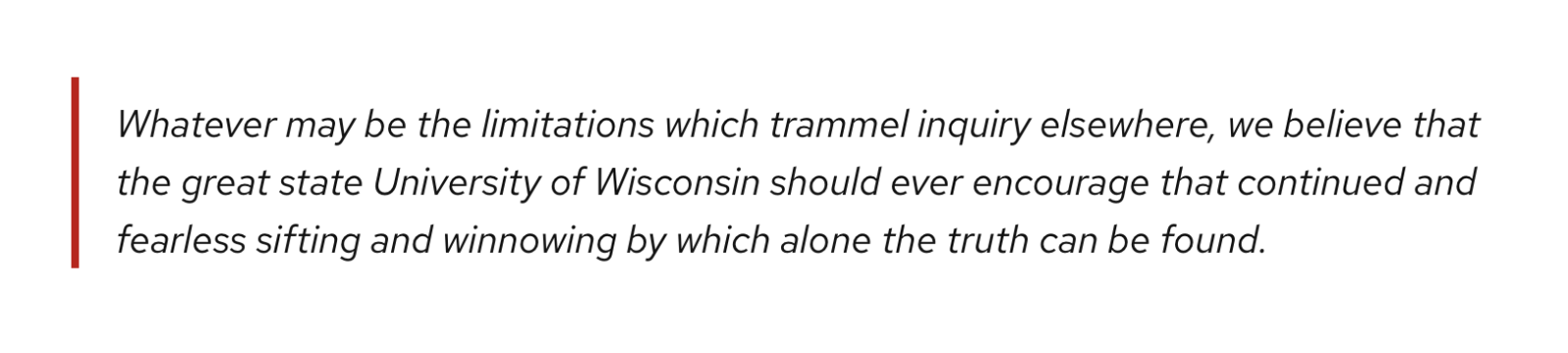
UW Theme Classic
Whatever may be the limitations which trammel inquiry elsewhere, we believe that the great state University of Wisconsin should ever encourage that continued and fearless sifting and winnowing by which alone the truth can be found.
UW Theme 2.0
Red Mini Bar
In UW Theme Classic, all page titles (H1) and section headings (H2) automatically displayed the red mini bar above them. Other heading levels did not include the Mini Bar.
In UW Theme 2.0, only page titles (H1s) display the red mini bar by default. For all other headings, the mini bar can be toggled on by selecting Mini Bar in the WordPress Core Heading block or Title block settings.
Visit Design Best Practices for guidance working with the Mini Bar and text in the theme.
Example heading
Heading with no Mini Bar
Example heading
Heading with a Mini Bar
Reusable content
In UW Theme Classic, if your site was hosted in WiscWeb, you may have used the Reusable Content plugin to create content that could be reused across your site and edited in one place.
In UW Theme 2.0, WordPress uses Synced Patterns, which let you create a custom layout with blocks and save it as a reusable pattern. Any updates you make to a synced pattern are automatically reflected everywhere it’s used.
UW Theme Classic
UW Theme 2.0