Block fundamentals
Last updated:
This guide covers the essential skills for working with UW Theme and WordPress blocks, including how to add, organize, style, and hide blocks.
For a detailed explanations of block concepts and editor behavior, visit the WordPress Working with blocks guide.
What are blocks
Like LEGO bricks, blocks are the basic building pieces of every page. Each piece of content you add in the editor is a block, including text, lists, images, buttons, links, and layout containers.
View the list of available blocks in UW Theme.
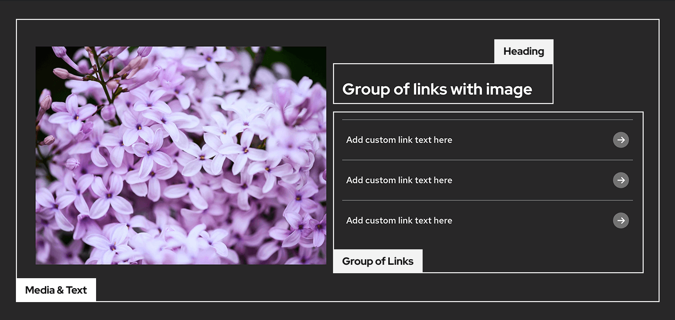
Tip: Start with patterns
Patterns are combinations of blocks that are already assembled for you. They help you create layouts quickly and follow UW–Madison branding and accessibility best practices.
Add blocks
You can add blocks in a few common ways:
- Use the Block Inserter (plus icon) in the top toolbar of the block editor
- Type a forward slash (
/) in the editor to search for a block - Click an Add block (plus icon) button that appears in the editor
View examples and learn more in the WordPress guide on Adding a new block.
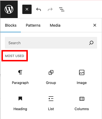
Tip: Show most-used blocks
You can set your preferences to show a list of your
most-used blocks at the top of the Block Inserter, which can speed up common workflows. Learn how set your editor preferences to enable this feature.
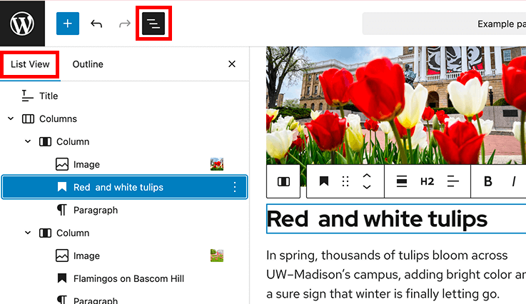
Manage blocks in List View
List View shows every block on your page in a structured list. It helps you select and manage blocks, especially in nested layouts or complex pages with layered content.
You can access List View from the top toolbar of the editor. Use it to select blocks in nested layouts, reorder blocks, and understand how your content is organized on the page.
Learn more in WordPress List View documentation.
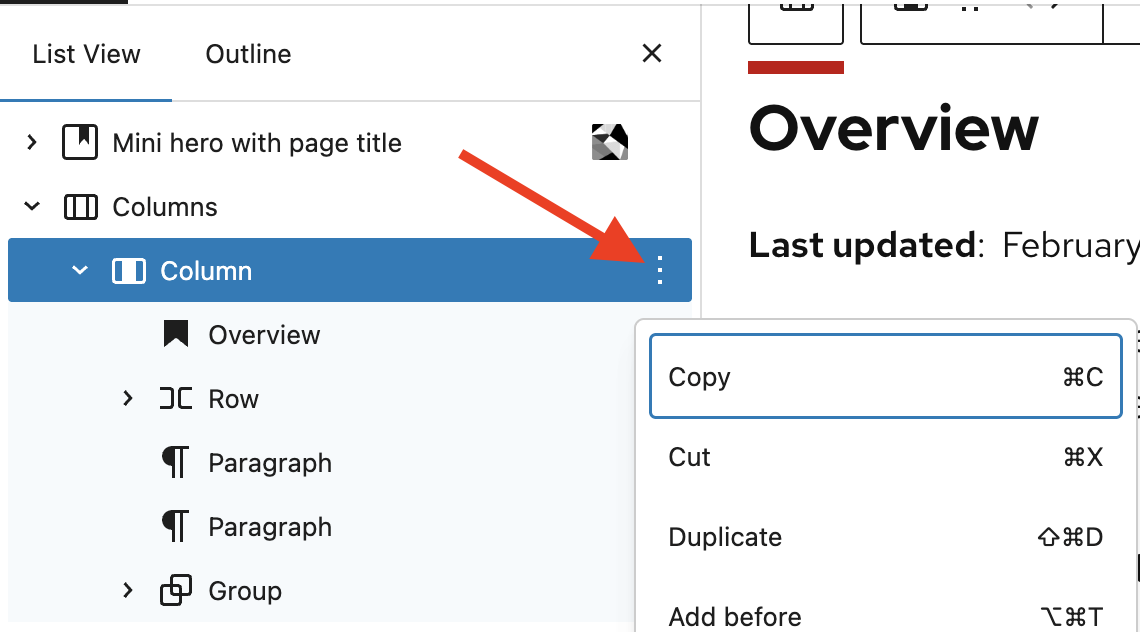
More options menu
You can also make changes to individual blocks using the More options (three-dot menu) in List View. This menu will display a dropdown selection of actions you can take for blocks like copy, cut, duplicate, remove, and more.
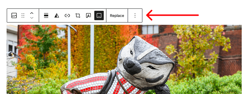
Block toolbar
When you select a block, the block toolbar appears above it. The toolbar includes quick actions such as alignment, formatting, move controls, transform options, and more options. Available actions vary by block type.
The highlighted controls below show a few key features of the block toolbar you may use often:
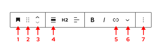
- Indicates the selected block type and allows you to transform it into a similar block.
- Drag/drop handle (six dots)
- Move block up or down
- Align options to manage content width or image alignment
- Link text options
- Additional text settings and options
- More options (three-dot menu) opens additional actions
View examples and detailed explanations in the WordPress Block toolbar documentation.
How to move blocks
Use the drag/drop handle or the move up and down controls in the block toolbar to reposition a block on the page. You can also drag blocks directly in List View, which is especially helpful for grouped or nested content.
For step-by-step guidance, visit the WordPress guide on Moving blocks.
Style and customize blocks
When a block is selected, open the Settings sidebar in the top toolbar of the block editor to view style and layout settings.
These settings vary by block but often include the following options:
- Color
- Typography
- Dimensions (margin, padding, block spacing)
- Borders and shadow
Settings also includes block-specific options like selecting the number of columns to use in the Columns block.
For guidance on making accessible, consistent design choices, visit Design best practices.
Can’t find a setting?
Some block settings may be unavailable in the UW Theme. This usually means the option has been intentionally limited to support accessibility, branding, or consistency across UW sites—or it’s currently under review.
If you think a setting is missing in error, contact the UW Theme team and let us know what you were trying to do.
Organize blocks
As your pages grow and become more complex, organizing and structuring blocks helps keep your content easier to edit, update, and maintain over time.
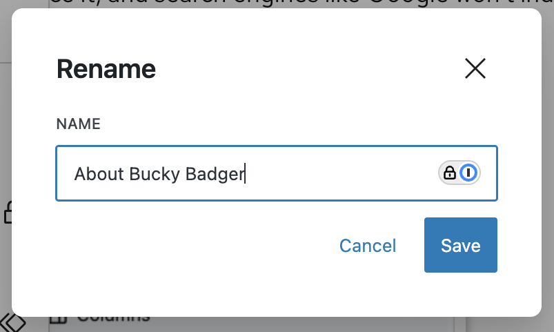
Rename blocks
As pages grow, naming sections can make them easier to manage and navigate. You can rename Group blocks and other blocks to describe the purpose of a section, such as “Intro,” “About,” or “Related links.”
Rename blocks by selecting Rename under More options (three-dot menu) in the block toolbar or List View.
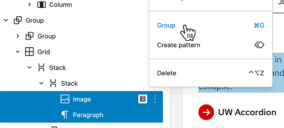
Group blocks together
You can group blocks together to create a custom section. Grouping lets you treat multiple blocks as a single unit, making it easier to move, style, and manage related content. Group blocks by selecting Group from the More options (three-dot menu) in the block toolbar or List View.
Learn more about the Group block.
Change block and content width
Visit the Managing content width guide to learn more about changing the content width.
Hide blocks and page content
Visit the Hide blocks and page content guide to learn more about hiding blocks.