Row and Stack blocks
Last updated:
The WordPress Row and Stack blocks are containers that hold and organize multiple blocks together. Use them to control the layout, spacing, and alignment of everything inside as one unit. Both are variations of the Group block.
Not sure if Row and Stack are the right blocks? See Choosing a layout block.
Row block
The Row block is a layout variation of Group that places blocks side by side in a single horizontal line. It’s best for 2–3 simple items, like short amounts of text. Row automatically sizes items to fit the available space, so you cannot set column widths.
Use Row to create a “Published on” or “Last updated” line for pages or posts by placing a Paragraph block next to the WordPress Modified Date block. In this example, .5rem block spacing has been applied to Row so the text and date sit closer together.
Row versus Columns
Row and Columns both let you place blocks side by side. The key difference is width control. The Columns block lets you set the width of each column, like 50/50 (two columns) or 33/33/33 (three columns). Row does not. Row automatically sizes items to fit the available space.
Stack block
The Stack block is a variation of the Group block. Use Stack to keep related blocks together in a vertical order with consistent spacing, like a heading, text, and button.
Stack is especially useful when you want to center or align a group of blocks all at once, so changing the alignment moves everything together as a unit.
Block toolbar
For a full overview of toolbar options and details explanations, visit the Row and Stack block documentation on WordPress.org.
When you select a Row or Stack block, a toolbar appears above the block. The toolbar includes justification, alignment, and content width controls.
Justification controls
Controls how items align along the vertical axis when they are different heights. Choose from top, middle, and bottom alignment. Below shows how to use Align middle to vertically center items a line of text next to the WordPress Social Icon block.
Email us
Top
Text is aligned to the top of the Social Icon block and feels disconnected.
Email us
Bottom
Text is aligned to the bottom of the Social Icon block and feels disconnected.
Email us
Middle
Text is aligned to the middle of the Social Icon block and feels like one unit.
Alignment controls
Controls how items are positioned along the horizontal axis. Choose from left, center, right, and space between. Space between pushes items to opposite ends of the container.
Left
Center
Space Between
Watch a brief demonstration of how alignment controls work in cards built with Stack blocks inside the Grid block.
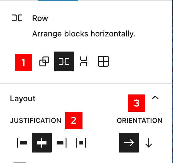
Block settings
Row and Stack also support color, type, dimensions/spacing, and border options. Visit the Row and Stack block documentation on WordPress.org for more information.
Select a Row or Stack block and open the block settings sidebar to see all available options.
- Transform: Change the block to another block variation: Group, Row, Stack, or Grid.
- Justification: Same options as the block toolbar.
- Orientation: Switch layouts from rows (horizontal) to stacked (vertical).
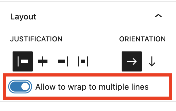
Optimize Row for mobile
Turn on the Allow to wrap to multiple lines setting so items within Row wrap to the next line when there isn’t enough space on smaller screens. Without it, items can become cramped or overflow on mobile.
Fix images inside Row and Stack
If you place an Image block directly inside a Row or Stack block, image width and height controls disappear. You may run into this in UW Theme card patterns that contain images. To fix this, do one of the following:
- Set the Image block height and width to the desired values first, then place it inside of Row or Stack.
- Wrap the Image block inside of a Group block — the width and height controls will reappear for the Image block. Learn how to group blocks.
What’s happening behind the scenes
Row and Stack blocks use flexbox for layout in CSS which is why sometimes content inside these containers can shrink or grow in unexpected ways. If you’re interested in learning more about flexbox in CSS, visit MDN: Basic concepts of flexbox.