Open Source Program Office
Last updated:
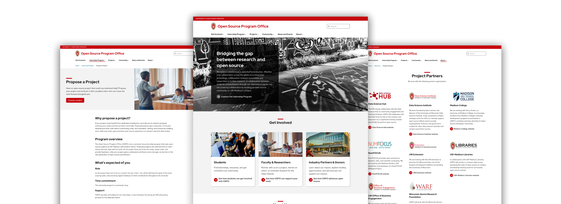
The Open Source Program Office website doesn’t rely on custom design to stand out. Its Badger Red accents, three-column card sections, and clear headings all come straight from the theme, so the team could focus on content and images. That’s what makes it a good model. Here’s what stands out:
On Brand
Leveraging, but not overusing, brand colors and elements like the heading mini bar make this site uniquely UW.
Meaningful images
Quality photos that are relevant to the content add meaning and depth to the pages.
Easy to navigate
A well organized main menu, and clear, descriptive headings make way-finding easy across the site and on pages.
Notable page designs
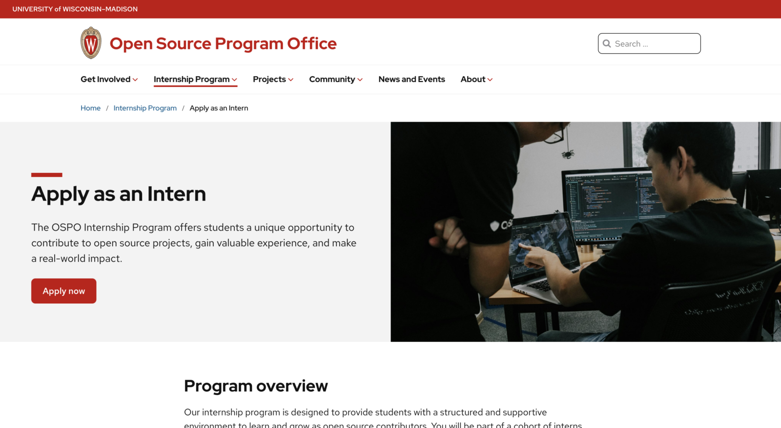
Apply as an intern
Instead of layering text on the image, the hero on this page uses the Media & Text block to place the heading, text, and button beside it. That avoids contrast problems and lets the image shine.
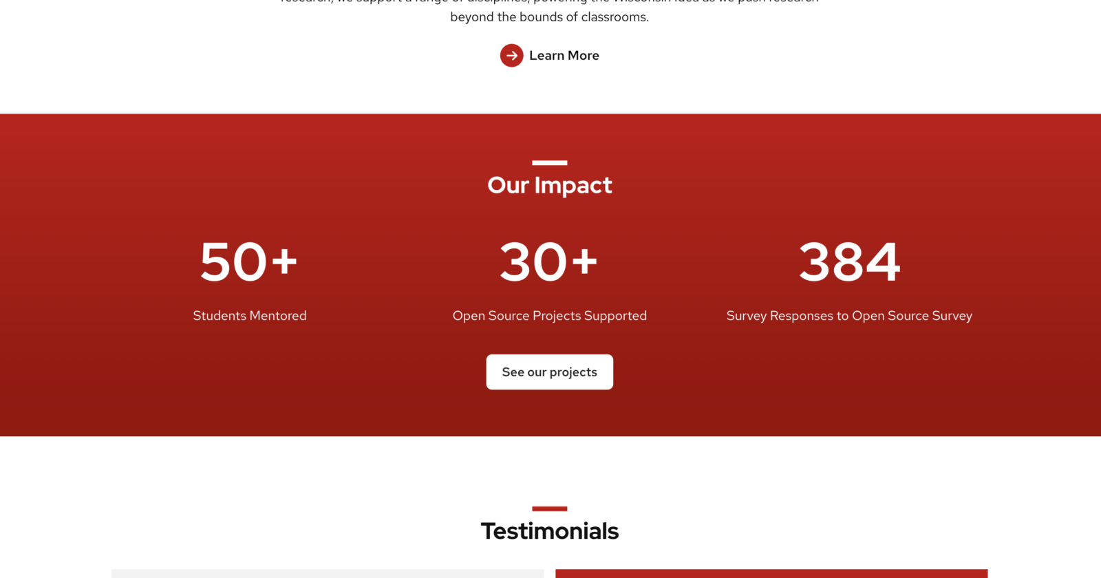
Homepage
On the homepage, OSPO uses the UW Theme’s Points of Pride pattern to present its impact as three bold figures on a full-width red gradient background. It’s an on-brand, ready-made way to show results without custom design.
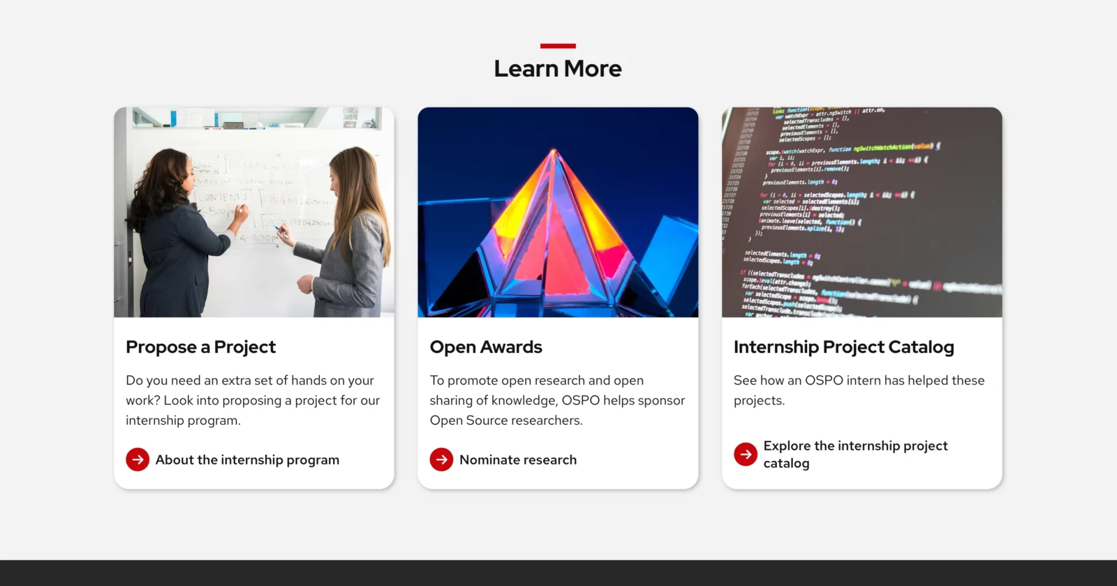
Faculty and Researchers
The same three-column cards appear at the bottom of key pages including the Faculty and Researchers page, giving visitors a predictable set of next steps to explore additional topics.
Need help making your content shine with the new theme?
Bring us your design questions!