The Wisconsin Exchange
Last updated:
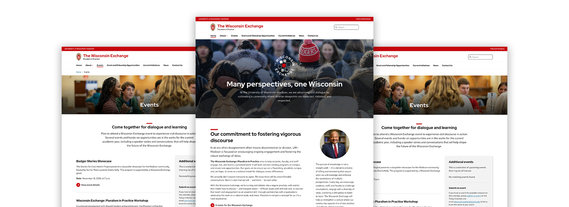
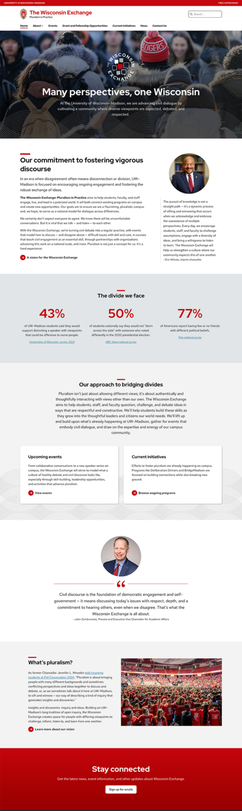
The Wisconsin Exchange website uses consistent patterns across pages, while tight content strategy and clearly-written headings and descriptions help ground the initiative. Limited but prominent custom logo use provides a great example of co-branding while remaining under the umbrella of the main UW brand.
Clear heading structure
Headings provide clear content hierarchy, making pages easily scannable and guiding users toward actionable information.
Plain language
The copy is clear and concise and avoids marketing speak. Headings are descriptive, putting important information first.
Visually balanced
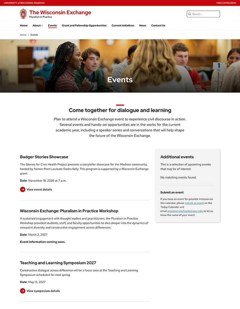
Generous, consistent spacing and appropriate use of the theme’s default separator help to delineate content sections in text-heavy layouts. A repeating 2-column pattern displays supplemental information off to the side out of the main flow of the page.
Meaningful images
Quality photos that reflect the tone and subject matter of the initiative are used intentionally across the site in mini hero page titles.
Easy to navigate
A mostly flat navigation lays out the structure of the site with clear, meaningful labels. Semantic headings break up page content, making it easily scannable.
Consistent design
Repeating patterns like mini heroes and brief introductory sections visually tie the pages together and provide helpful context for users when they arrive.
Need help making your content shine with the new theme?
Bring us your design questions!