Choosing a layout block
Last updated:
This guide is for users already experienced with the WordPress block editor and block fundamentals. Layout blocks include Group, Row, Stack, Grid, Column, Media & Text, and Cover. These blocks control how content is grouped and arranged on your page. Use this guide to find the right one for what you’re trying to build.
Always start with patterns
The quickest way to build layouts is by using a UW Theme pattern. Patterns are pre-made layouts that already combine the right blocks with recommended spacing, color, and accessibility settings. Use layout blocks only when you need something custom or when modifying an existing pattern.
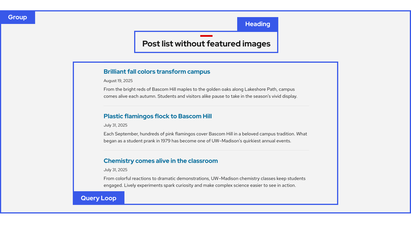
Group block
Use Group when you need to hold one or more blocks together. Group is like a box for storing other content. Once grouped, you can move and style it as a single unit, such as adding a full-width background color.
Row and Stack blocks
Use Row when you need a small number of items sitting on one line together, like an icon next to text. Row sizes items automatically so you cannot set fixed column widths.
Use Stack when you need items arranged vertically with consistent spacing and alignment. For example centering an image, heading, and button together inside a card all at once.
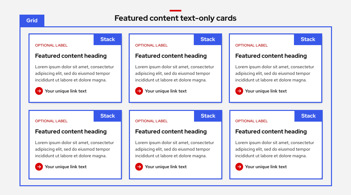
Grid block
Use when you need a repeated layout that flows across multiple rows, like a grid of cards with equal height and width. Grid also lets you resize individual items so some can be wider or taller than others.
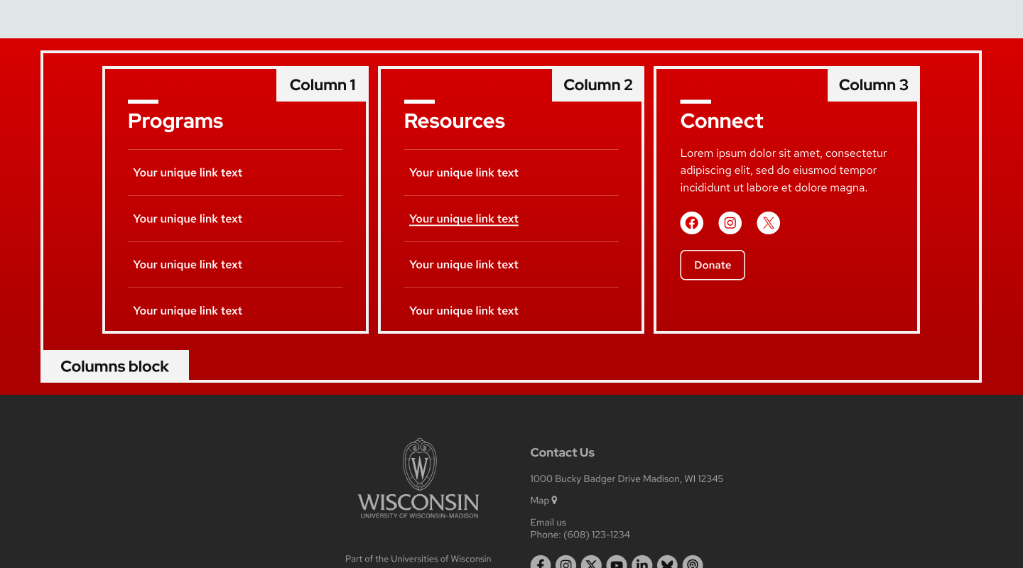
Columns block
Use when you need side-by-side columns with defined proportions like 50/50 (two columns) or 33/33/33 (three columns). On mobile, columns stack top to bottom in the order they appear on desktop.
If you need images to always stack above text on mobile, use the Media & Text block instead.
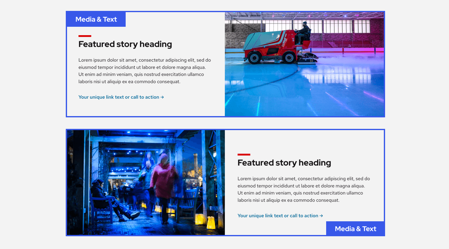
Media & Text block
Use when you need to pair images and text in a two-column layout where images always stack above text on mobile to preserve the reading order. This block is most commonly used for creating alternating image and text sections that create a zigzag effect.
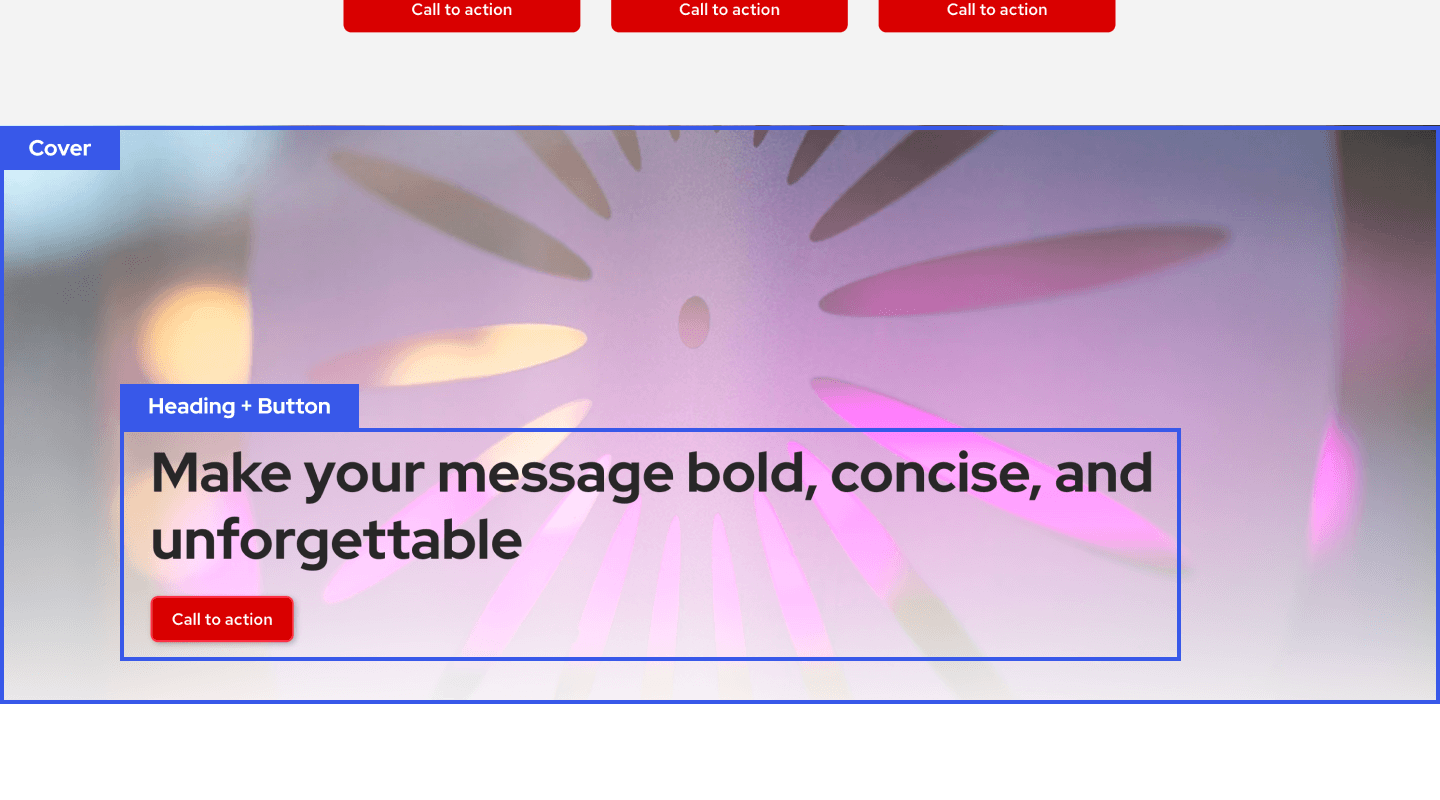
Cover block
Use when you need to place content on top of a background image or gradient color for stronger visual treatment, like a hero image at the top of your page.
The Cover block is similar to Group because it holds content together, but it adds background image, gradient, and overlay opacity controls.