
Design best practices
Overview
By building with UW Theme 2.0, your site taps into the strength of the
UW–Madison brand. This help you build trust, strengthen connections with your audiences, and create a presence that feels distinctly UW.
Below you will find simple best practices for using theme styles and features to accomplish your goals.
Visit the UW–Madison Brand and Visual Identity site for official brand guidance.
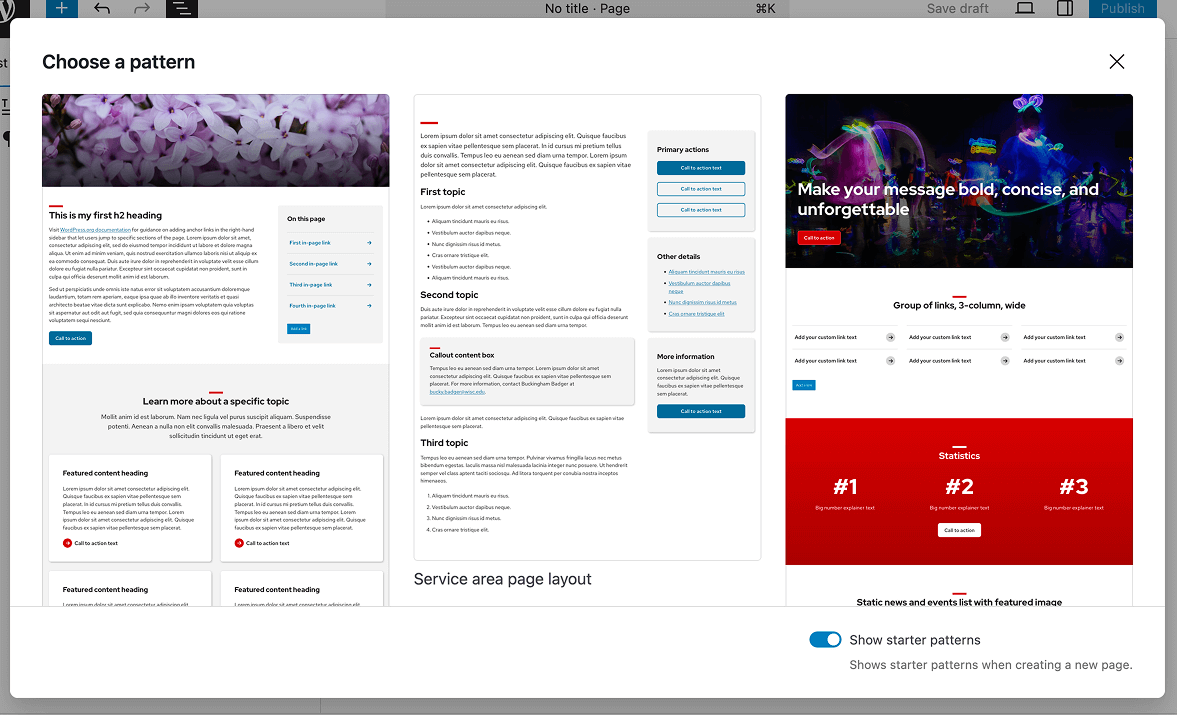
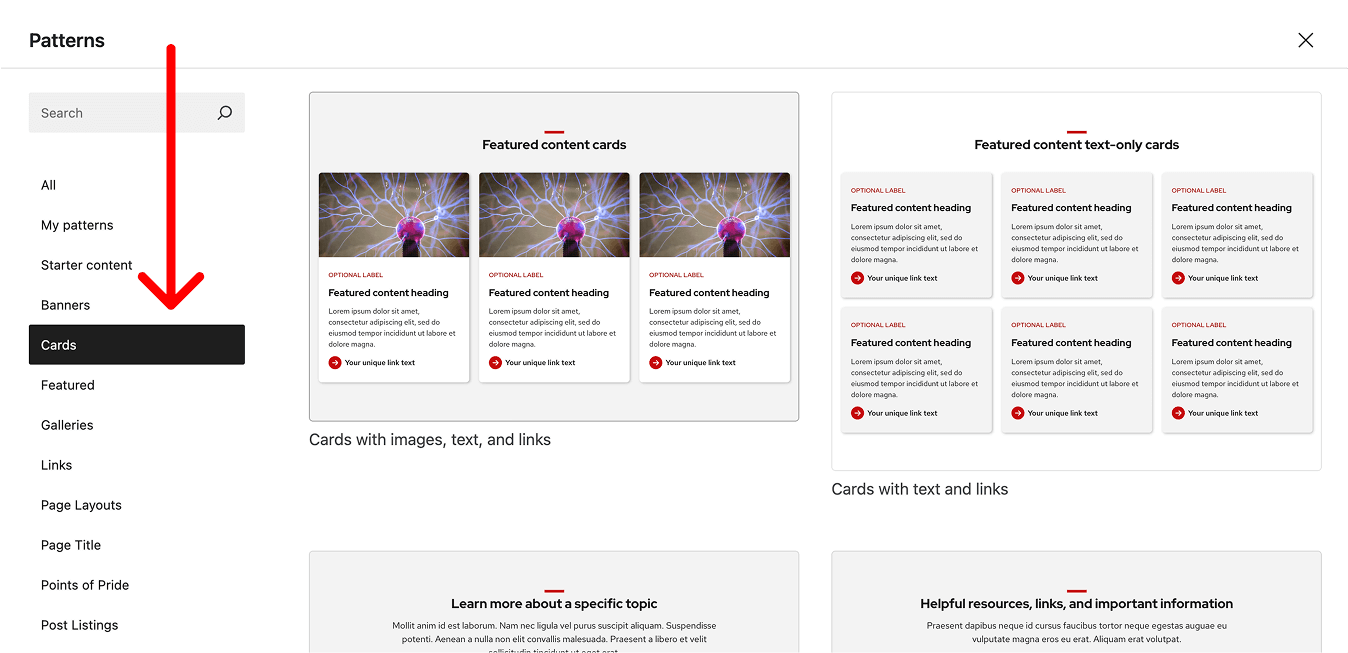
Start with patterns
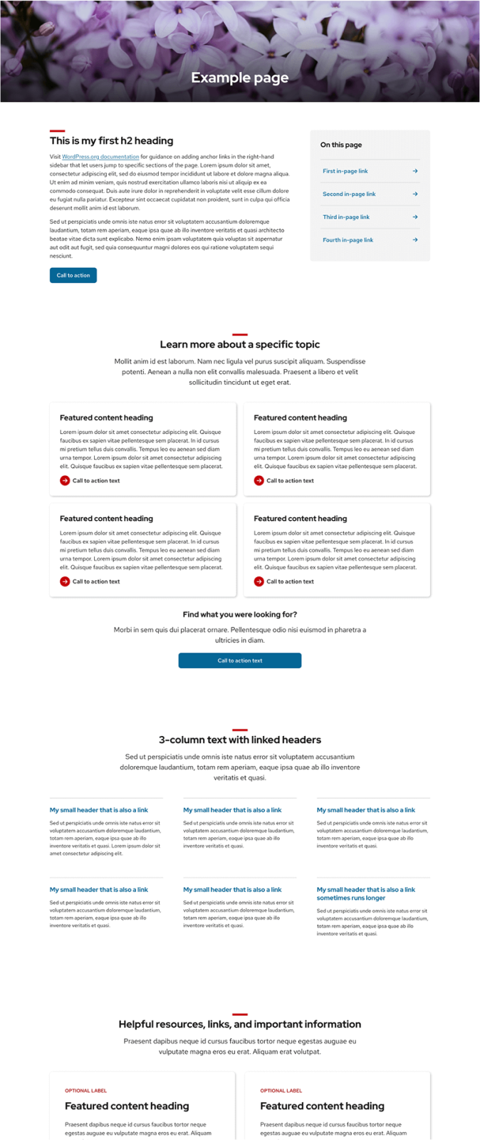
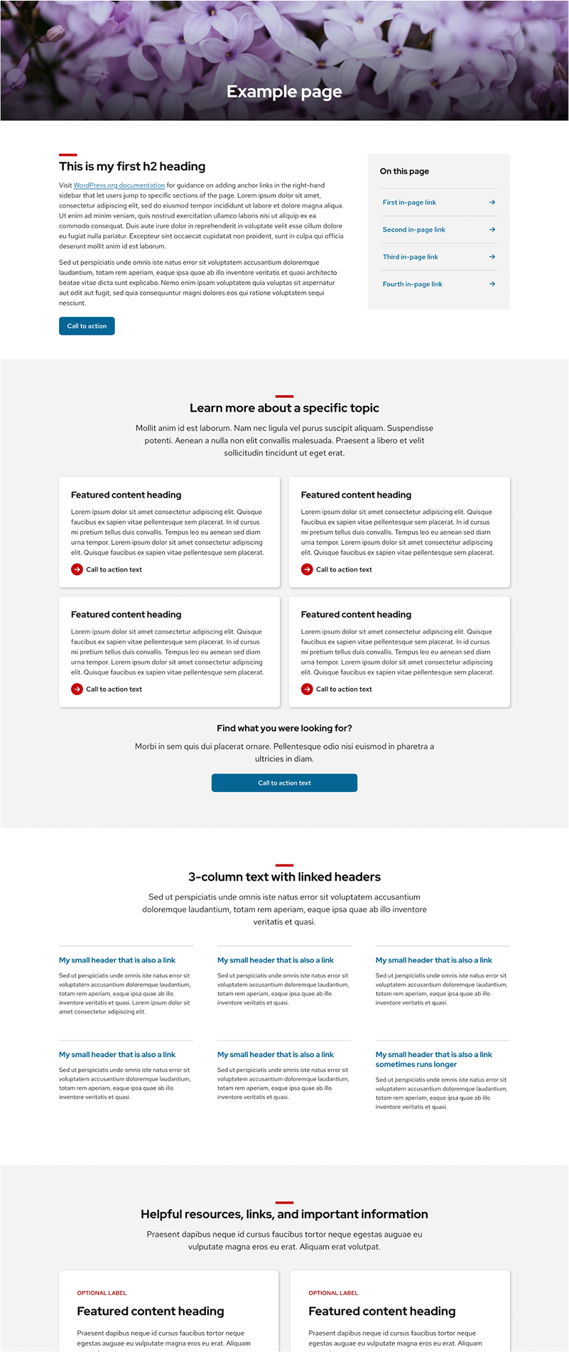
Patterns are pre-built layouts that combine blocks with recommended design and accessibility practices. They’re the fastest way to build pages that feel consistent, readable, and on-brand without designing layouts from scratch.
Start with a pattern whenever possible. Patterns already apply appropriate spacing, typography, and color use, which helps pages feel cohesive across the site. You can customize patterns to fit your content, but avoid rebuilding layouts from individual blocks unless you have a specific need.
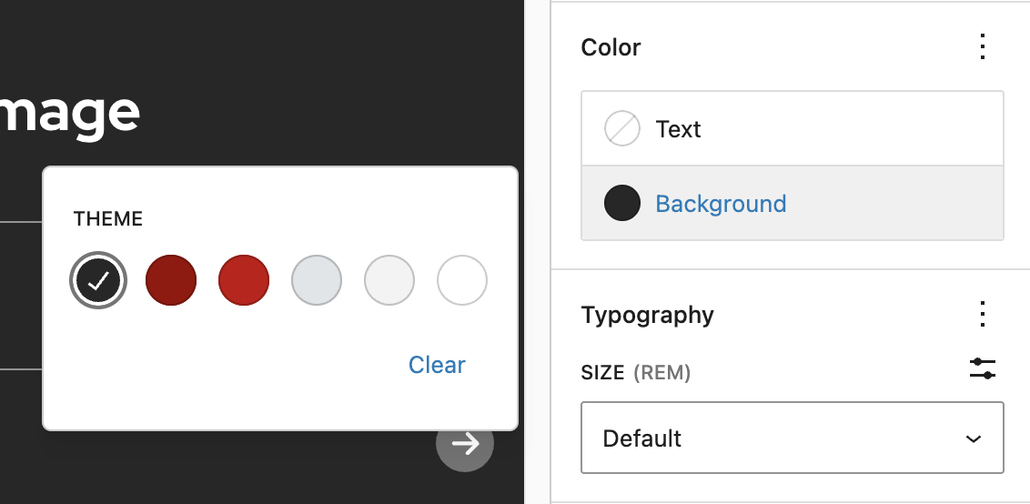
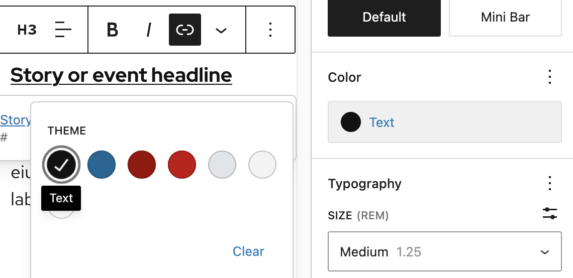
Theme color palette
UW Theme 2.0 includes built-in text and background color palettes designed to work together and meet accessibility contrast and brand requirements.
For general guidance on applying color in the block editor, visit the WordPress Color Settings overview. Color options in UW Theme are customized to support branding and accessibility standards.
Background and text color palettes
For core WordPress blocks, the theme provides a limited set of background and text colors designed to work together and meet contrast requirements.
Background colors are available on design/layout blocks (such as Group, Columns, and Cover) and work best when applied to sections of content to group related information and support page structure.
Text color options are available on text blocks (such as Paragraph, Heading, and List) and should be changed only when they add meaning or are necessary to ensure sufficient contrast. Rely on size, spacing, and layout before adjusting text color.
Auto color switching
The theme automatically changes colors for most blocks when backgrounds change to meet contrast requirements. In some cases, you may need to manually change colors of elements, like the Buttons block, to enhance accessibility.
Below are two examples showing how the Heading, Paragraph, and UW Link block automatically switch to white on dark backgrounds and black on light backgrounds.
If you see a bug or color mismatch, please contact the UW Theme team.
Working with text
Typography plays a key role in readability, hierarchy, and how easily people can scan a page. In the UW Theme, typography styles are designed to work together to support readability, accessibility, and brand consistency.
For detailed guidance on how to access and use typography settings in the block editor, visit the WordPress Typography Settings overview.
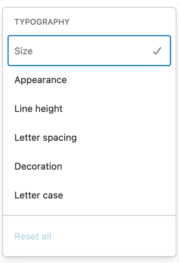
Typography settings
UW Theme uses Red Hat Display for headings and Red Hat Text for body content. These fonts are built into the theme to support readability and alignment with UW–Madison brand standards.
Learn more about the Red Hat typefaces
WordPress includes options for adjusting font size, weight, and spacing. Keep text styles simple and rely on theme defaults and patterns whenever possible. They are designed to work together across pages and screen sizes.
Headings and hierarchy
Headings help people understand how content is organized and where to focus as they scan a page. They also help screen readers identify sections and navigate content. Clear hierarchy is especially important on long or content-heavy pages.
For details on setting accessible heading levels in the UW Theme, refer to the Working with page titles and headings guide.
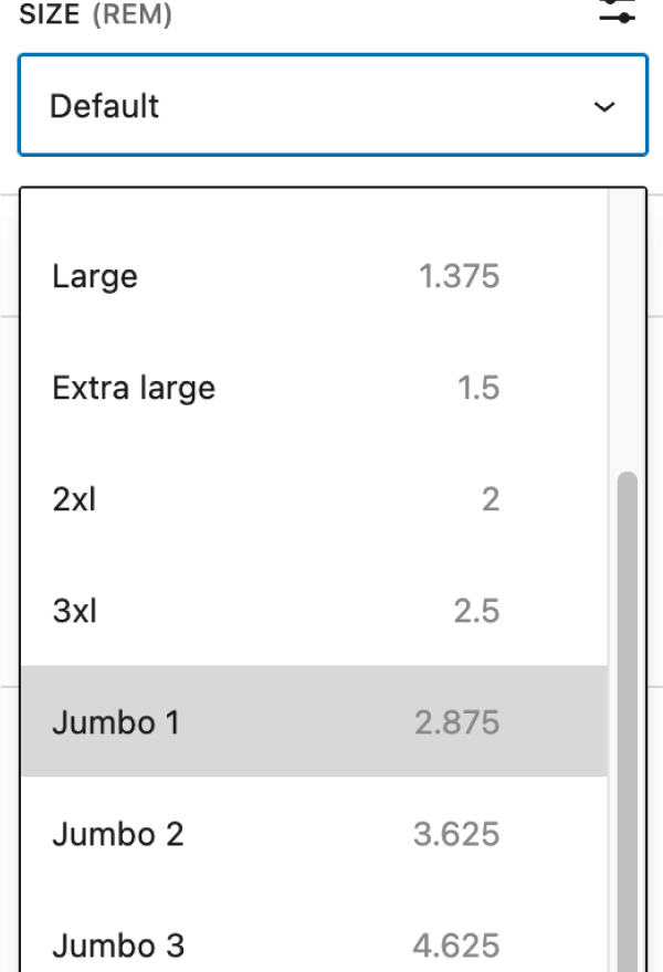
Jumbo font sizes
UW Theme includes three Jumbo font sizes for expressive headings when using the Heading block. Use Jumbo text sparingly for short, impactful statements, such as making bold statement at the top of a page or breaking up long sections.
Avoid using Jumbo sizes for long headings or full sentences.
Jumbo font size 1
Jumbo font size 2
Jumbo font size 3
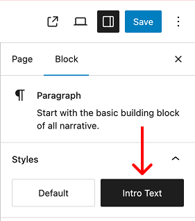
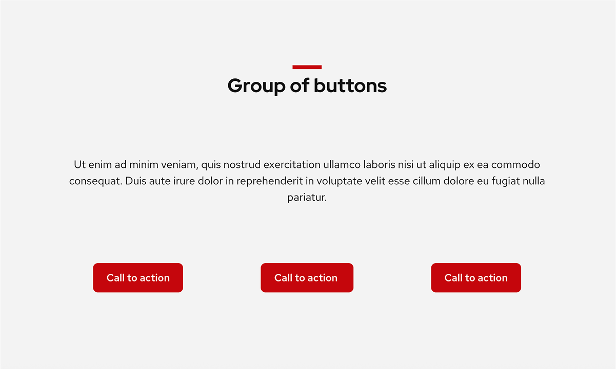
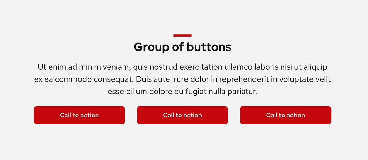
Intro Text paragraph style
The Paragraph block includes the option for an Intro Text style best used directly below a page title or section heading to introduce the page or section. Intro Text is slightly larger than the default paragraph size so the content stands out.
Limit its use to one per page or section to keep the content hierarchy clear.
Default paragraph size
Intro Text paragraph size
Select the Intro Text button in the Paragraph block settings to apply this to your text.
Heading color
In UW Theme, red and blue already carry meaning, so changing heading colors can confuse readers or make headings look like links or calls to action. It can also add unnecessary visual noise.
Before using color, rely on heading size, spacing, and the Red Mini Bar style for page titles and headings to create emphasis first.
Red style heading
Don’t do this
Don’t make all headings red across a page or site. Reserve red for short, key headings.
Heading with mini bar
Do this
Use the Red Mini Bar for emphasis before changing heading color.
Blue style heading
Don’t do this
Don’t style headings to be the link blue color if they are not a link.
Do this
Use the default heading styles when headings are linked.
Red Mini Bar
The Title block and Heading block include an optional Red Mini Bar style, a red line that appears above the text for emphasis. The Red Mini Bar is enabled by default on new page titles, but is an optional style.
If you use the Red Mini Bar, apply it consistently across your site. It works best on H1s for page titles and H2s for page sections. Avoid using it on smaller headings so it doesn’t feel overused or visually distracting.
For details on where to find and manage the Red Mini Bar setting, refer to Working with page titles and headings.
Red Mini Bar
No Red Mini Bar
Link color
Links use UW Theme’s default blue to ensure accessible link color contrast and consistency across sites. The default blue link color is a clear, familiar cue that text is a link. Changing link colors can make links harder to recognize.
Don’t do this
Don’t change link colors to red, gray, or black as a design choice.
Do this
Use the default blue link color for text links.
Uppercase text
Avoid using all-caps text in UW Theme. All-caps text can be harder to read, particularly for people with low vision or cognitive disabilities. Headings should not use all-caps because they become harder to read and scan. If used at all, limit all-caps to short labels only (one or two words), such as category labels in news or post listings.
For additional guidance on text styling and readability, review the Digital accessibility fundamentals guide from the Center for User Experience.
Additional resources
Cover block for gradients and overlays
The Cover block is the only block in the UW Theme that supports background images, gradients, and opacity overlays. It’s designed to help you create visually distinct sections while keeping text readable and accessible.
When placing text on top of images or colored backgrounds, contrast and readability should always come first. Decorative treatments should never make text harder to read.
Test your designs on mobile using the WordPress View feature to ensure your text can be read when repositioned on the image.
Gradients for text over images
Text placed on top of images should be used sparingly. When it is used, always apply an overlay or gradient to improve contrast and ensure text remains readable.
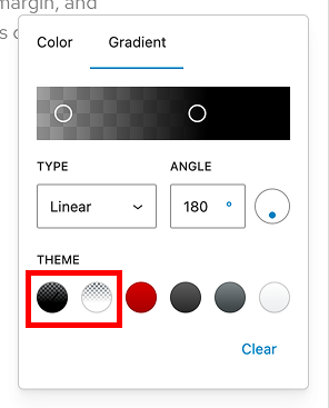
The theme includes two gradients designed specifically to improve text readability when text is placed on an images:
- Image with Text – Black Gradient
- Image with Text – White Gradient
Adjust the opacity and gradient start/stop points as needed to create enough contrast for your text.
Very weak text contrast
Image has no overlay gradient
Better text contrast
Image has the Image with Text – Gradient applied with 80% opacity
Gradients for solid background colors
The theme includes four gradients that are intended to be used without an image and appear as solid background colors.
These gradients are designed to create visually distinct sections while keeping text clear and readable.
Avoid using Badger Red on top of images, as they reduce contrast and make text harder to read.
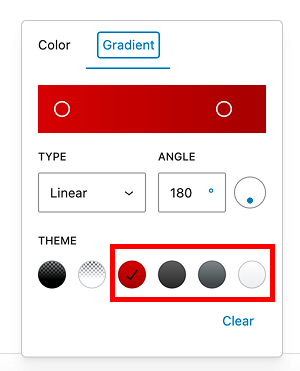
Badger Red Gradient
Dark Gray Gradient
Medium Gray Gradient
Light Gray Gradient
Overlay colors and opacity
The Cover block includes a limited set of overlay colors and an Overlay Opacity slider. These controls work together to keep text readable without needing custom colors.
Adjust opacity until text is clearly readable while still allowing the image to show through.
Black or white overlays work best on images. Reserve other colors for solid backgrounds without images.
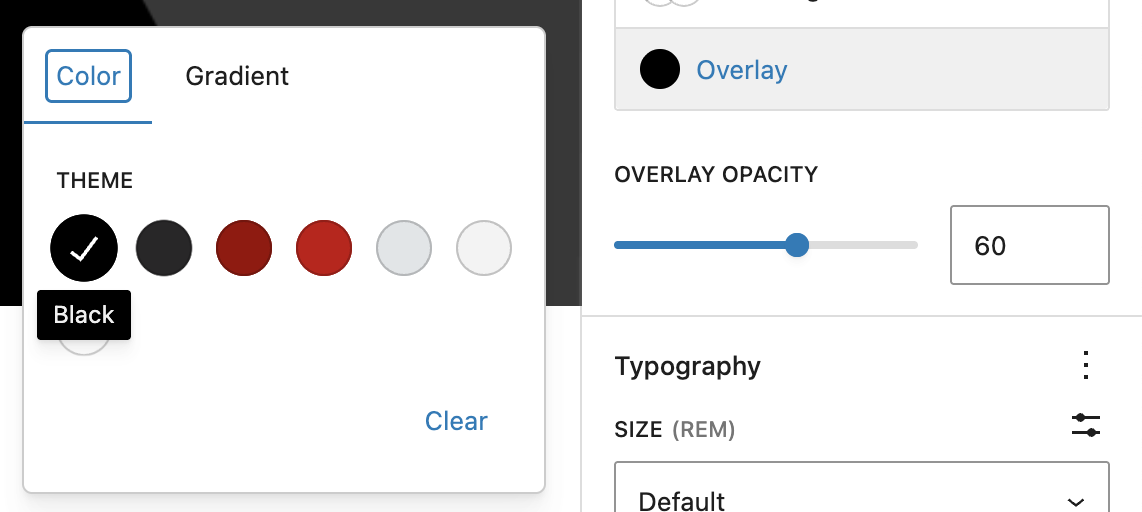
The examples below also use a Duotone filter to convert the images to black and white.

White overlay, 80% opacity
White overlay, 60% opacity
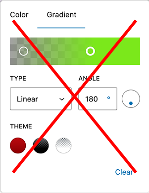
Don’t use custom gradient colors
While the editor allows custom hex values for gradients, these should be used with caution. This option is provided only to improve contrast and readability.
Custom or non-brand colors can reduce contrast and make text harder to read. In most cases, use the preset gradients and adjust opacity or gradient position instead.
Change content position for clarity
You can reposition content within the Cover block to place text over a simpler area of the image. This can significantly improve readability, especially on wide images.
Learn how to change content position.
Top aligned text
Bottom aligned text
After repositioning text, always check how the layout appears on smaller screens to ensure text remains readable.
Drop shadows
Drop shadows add subtle emphasis by separating elements from the background. They work best for images, buttons, or card-style layouts when grouping a small set of related content.
Learn how to apply drop shadows to blocks in the WordPress Border & Shadow Settings guide. For buttons, refer to the theme’s Buttons block documentation.
Use drop shadows sparingly
Overusing shadows can make pages feel cluttered and make it harder for users to understand what’s most important on the page.
For consistent results, start with patterns that already use drop shadows in a balanced way.
Card-style patterns often include shadows that work well across layouts and screen sizes.
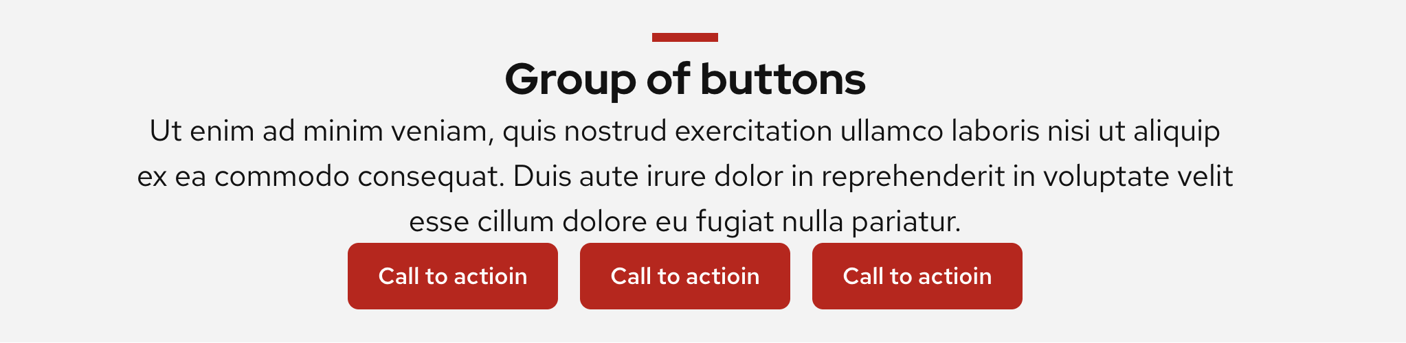
Drop shadow examples

Card style with a drop shadow
This card was made by applying a white background color to the Group block along with Large padding applied to the top/bottom and left/right of the block, and a drop shadow. Inside of the Group block contains the Heading, Paragraph, and UW Link blocks.
Spacing
Spacing controls appear under Dimensions in block settings, including padding, margin, and block spacing. In UW Theme 2.0, start with patterns and then customize them to meet your needs. They already include recommended spacing for consistent layouts.
For definitions and general guidance on using spacing controls, visit the WordPress Dimension Settings overview.
Use consistent spacing
When building pages without patterns, be intentional about spacing. Use similar padding between sections so layouts feel cohesive. Too little space can make content feel crowded, while too much creates awkward gaps that interrupt flow.
Patterns already include ideal spacing within content sections and between sections.
Avoid the Spacer block
The Spacer block can seem like a quick fix, but it often leads to inconsistent layouts and does not adapt well on smaller screen sizes.
Instead, rely on spacing controls and patterns to manage space in a more consistent way to ensure your content looks good on different devices.
Separate sections with background colors
Spacing isn’t the only way to separate content. Alternating background colors can create clear visual breaks between sections and make long pages easier to scan.
The easiest way to do this is by starting with patterns that already apply background colors to section groups.
Borders
Borders can be used to subtly emphasize content, separate content, or create simple shapes (like circular images), but they should remain subtle and neutral. In UW Theme, borders are not intended to be the primary way to draw attention to content.
This guidance also applies to the WordPress Separator block.
For general guidance on accessing and managing border and shadow settings, visit the WordPress Border & Shadow Settings overview.
Use the default border color and line style
It can be tempting to use decorative borders, but in most cases they add visual noise instead of helping. In UW Theme, borders are meant to stay neutral so they support content without pulling attention away from it.
Use the default border color (#CFCFCF) and keep borders subtle by adjusting only the border width (4px or less).
Red border, dashed line style, 20px border width
Don’t do this
Don’t use bold or decorative borders.
Default border color and line style, 2px border width.
Do this
Use the default border color with a 4px or less pixel width.
Avoid borders around images
Bold or colored borders around images tend to overpower content and disrupt visual consistency across UW sites.
Instead, use a drop shadow or the Rounded style option in the Image block to add gentle emphasis without competing with the content.
Don’t do this
Don’t use colored or bold borders around images.
Do this
Use rounded corners and/or drop shadows to emphasize images instead.
Avoid borders around content sections
Borders are often misused to make content “stand out,” especially around full-width sections. This design compete with the content itself.
Use background colors or card-style patterns with optional drop shadows to group content in a softer, more readable way.
Content section with background color and black border
Don’t do this
Don’t add borders around full-width content sections.
Content section with a dark red background color
Do this
Use background colors or card patterns to enclose or highlight content.
Use border radius for circular images
Border radius can be used to create circular images, but it requires the correct aspect ratio.
Set the Image block aspect ratio to Square (1:1) before applying a 100% border radius to create a true circle.
Don’t do this
Don’t create rounded images that are oval and appear stretched.
Do this
Create a circle shape using a square aspect ratio and 100% border radius.