
UW Heading Highlight
Last updated:
The UW Heading Highlight adds a Badger Red or white background behind each line of a heading text when it appears inside a Cover block. Use it to give a short, important message stronger visual emphasis over a background image.
The treatment works best in homepage and landing-page hero sections.
When to use heading highlight
Use the UW Heading Highlight on homepage or landing-page hero images to help a primary heading stand out.
Because the heading highlight creates strong visual emphasis, use it for the most important heading in a hero section rather than repeating it throughout the page.

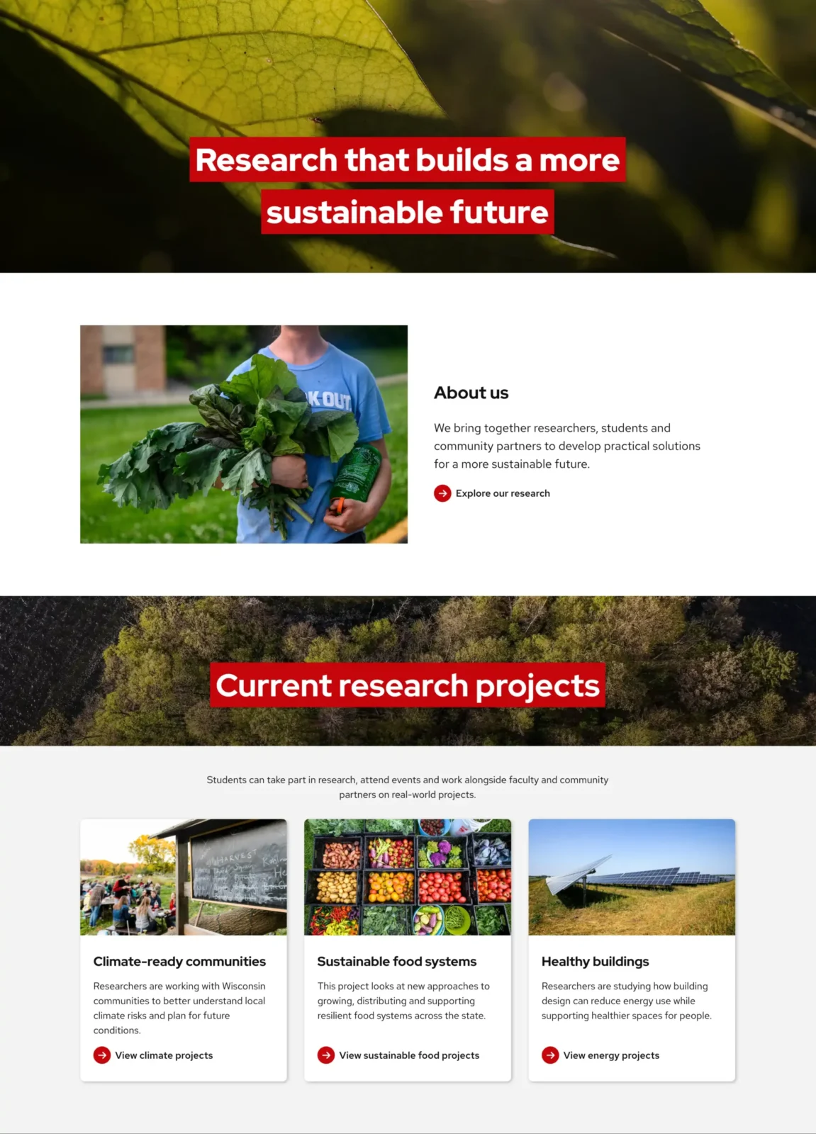
Don’t do this
Don’t use the heading highlight on multiple sections of the same page. This can make the sections compete for attention.

Do this
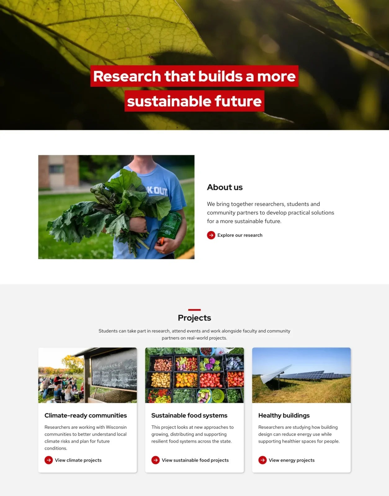
Use the heading highlight for the primary hero message, then use standard heading styles for supporting sections.
Start with a banner pattern
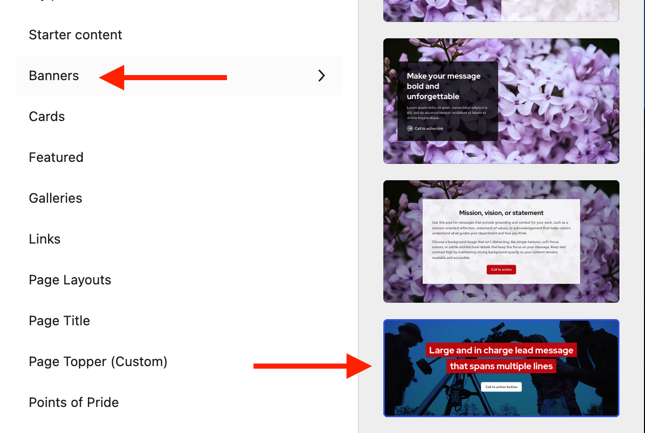
The easiest way to use the heading highlight is to start with the available UW Theme banner pattern.
- Select the + button in top toolbar of the editor to open the block inserter.
- Select the Patterns tab
- Select Banners
- Choose the banner pattern that uses the UW Heading Highlight
- Replace the example text, image and other content with your own
Starting with the pattern gives you a ready-made layout and reduces the number of design decisions you need to make.
Enable heading highlight
The UW Heading Highlight is only available for Title and Heading blocks when they are placed inside a Cover block.
To enable this setting, follow the steps below:
- Select the Title or Heading block inside the Cover block
- Open the block settings sidebar
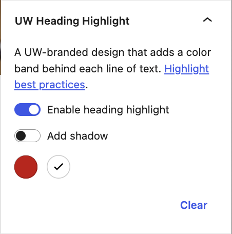
- Find UW Heading Highlight
- Turn on Enable heading highlight
- Select Badger Red or White as the highlight color
Drop shadow
Turn on Add shadow if the heading highlight needs more separation from the background image. Refer to the Improve heading contrast section for guidance on when to use shadow.
Color options
Choose the heading highlight color based on the area of the image behind the heading.
Badger Red
Badger Red works best over light or neutral areas where the highlight is clearly distinct from the background.
Avoid using it over large areas of red or similar colors, where the highlight can begin to blend into the image.

White
White works best over darker areas where the edge of the highlight remains easy to distinguish.
Avoid placing it over very light areas of an image, where the white background can blend into the photo.

Choose a background image
Choose a background image that gives the heading clear visual separation and keeps the message easy to read.
Look for images with:
- Simple or more abstract compositions
- A clear, uncluttered area where the heading can sit
- Enough space around people and other important parts of the image
- Colors that don’t blend in with the heading highlight
- A composition that still works when the image is resized on smaller screens
Don’t do this
Don’t choose close-up or highly detailed images where the heading would cover important parts of the photo, such as faces.

Do this
Choose wider, more environmental photos with enough open space for the heading to stand out without competing with the image.

Heading best practices
Keep highlighted headings short, easy to scan, and visually distinct from buttons or other interactive elements.
Heading length
The heading highlight works best with short, focused messages. Aim for about 5–8 words that fit comfortably on one or two balanced lines.
Don’t do this
Don’t create headings that are so short they look like a button, or so long that they create more than two highlighted lines.

Do this
Keep headings concise so they fit comfortably within one to two highlighted lines.

Font size
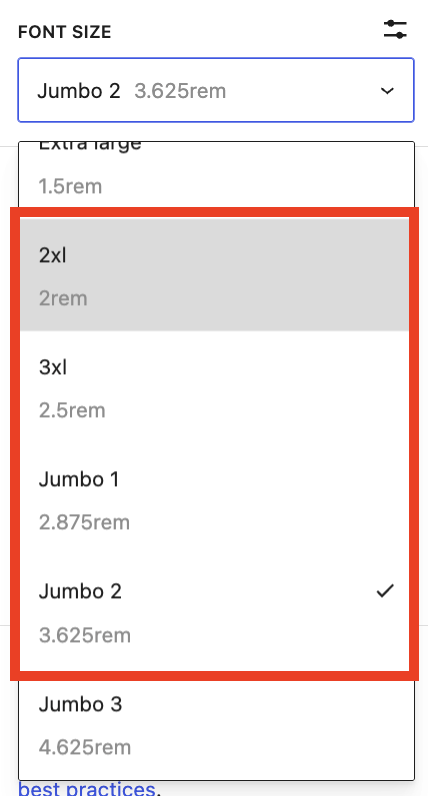
Use a font size between font sizes 2xl and Jumbo 2. Smaller sizes can make the highlighted text look more like a button, while larger sizes can overwhelm the image.
Choose a size that gives the heading enough emphasis without creating awkward line breaks.
Font size and heading level are different. Choose the heading level based on the structure of your page for accessibility, then adjust the font size separately.
Visit the Working with page titles and heading guide for more information.
Links
Keep the text in the UW Heading Highlight as plain heading text. Do not add a link to the highlighted heading.
If the hero needs a call to action, add a separate Buttons block below the heading instead.
This keeps the heading visually distinct from interactive elements and makes it clearer what users can select or click.
Don’t do this
Don’t make the highlighted heading itself a link.

Do this
Keep the highlighted heading as text, then provide a separate button.

Position the heading carefully
Place the heading where it does not cover important parts of the background image.
Use the Cover block’s content position controls in the block toolbar to move the heading to a clearer area of the image.
Refer to the UW Theme Cover block documentation for guidance using this block.
If needed, adjust the image focal point so important content stays visible when the image is cropped or resizes on smaller screens.
Use the View feature in WordPress to preview your layout on Mobile and Tablet.
Don’t do this
Don’t place heading over:
- Faces or people
- Important objects or subjects
- Signs or text within the image
- Detailed or visually busy areas

Do this
Look for areas with more open space, such as:
- Sky
- Plain walls or architectural surfaces
- Open landscape
- Less detailed areas beside the main subject

Improve heading contrast
Use an image overlay
Use the Cover block’s color overlay settings to darken the background image when needed.
A black overlay with 20-30% opacity is a useful starting point. You can also try the Cover block’s default gradient overlays, which allow more of the image’s original colors to show through.
Adjust the overlay so the heading remains easy to read without making the image unnecessarily dark.
Use a drop shadow
If the heading highlight still blends into the background after adjusting the image overlay, try turning on Add shadow in the UW Heading Highlight settings.
A shadow can be especially helpful when using a white highlight over a light or varied image.
You may not need both settings. Choose the combination that makes the heading highlight stand out clearly without unnecessarily darkening the image.
Get more help
WiscWeb sites
If your UW Theme 2.0 site is hosted in the WiscWeb WordPress Service, contact their support team for help.
Non-WiscWeb sites
If you manage or develop a custom
UW Theme 2.0 site outside of WiscWeb, email the UW Theme team.
Weekly Office Hours
Get one-on-one help with design, accessibility, and WordPress in weekly office hours.
Not sure who to contact? Email the UW Theme Team or find additional resources.